
Joomla guide v0.8.22-alpha
Oui Blocks is a visual page builder for Joomla 5 and 6: sections, rows, columns and elements, a shared design system, modals, scenarios and editing right on the page, without ever overriding Joomla.
Features
Visual builder
Library, canvas, drag-and-drop navigator, Content, Style and Advanced tabs, three screen sizes, undo/redo.
Design system
Tokens (colours, fonts, spacing) and reusable classes with per-screen and hover variants, usage tracking, WCAG contrast check.
Live preview
The unsaved page in the site's real template, clickable, and "preview as" any user group.
Dynamic data
Element fields take their value from the article shown or its custom fields; layouts attached to articles.
Layouts as modals
Any layout opens in an accessible dialog: size, position, backdrop, closing; link to #oui-layout-ID.
Scenarios
Triggers, conditions and actions from plugins: exit intent, number of visits, scroll depth… then open a modal.
Dynamic UI
Header, footer and side panels by menu-item rules, shown by the Blocks module.
Editing on the page
Headings, texts, buttons and images are edited right on the site; the full builder also opens from the page, with the same rights.
Oui Widgets
Sixteen widgets: animated counter and text, before/after, sliders, galleries, horizontal scroll, scroll video, map, mega menu, 360° view…
Effects
Sticky header, parallax, reveal on scroll, scroll-aware colours, cursor, tooltips, whole-box links, copy to clipboard.
Custom fields
Place any article custom field (media, list, date, subform…) with Joomla's own rendering and its label.
Template overrides
Create and edit view overrides from Oui Blocks: a Blocks layout or a copy of the original, with a syntax check and backups.
Ready-made demos
Eleven modern pages to import, four of them combining the Oui extensions, with a sample-content installer.
Oui ecosystem
Forms, Poll, Visualize, 3D Viewer, DAM, Pay, Assets and All Medias elements; a documented API for your own elements.
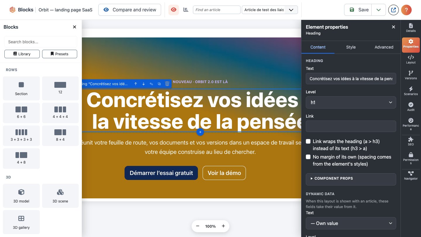
Oui Blocks is a visual page builder for Joomla 5 and 6. You build pages from sections, rows, columns and elements, style them with a shared design system, and show them through normal Joomla features: a menu item, a module or an article. It never overrides Joomla or rewrites your pages.
Install
Install pkg_blocks_<version>.zip from System → Install → Extensions. The package contains the
component, the element plugins (Blocks - Core, Blocks - Custom), the content plugin, the
"Blocks layout" custom field plugin, the scenario plugins (Blocks Scenario - Core steps and
System - Oui Blocks scenarios) and the mod_blocks module. They are enabled on first install.
Requires Joomla 5 or 6 and PHP 8.1 or later.
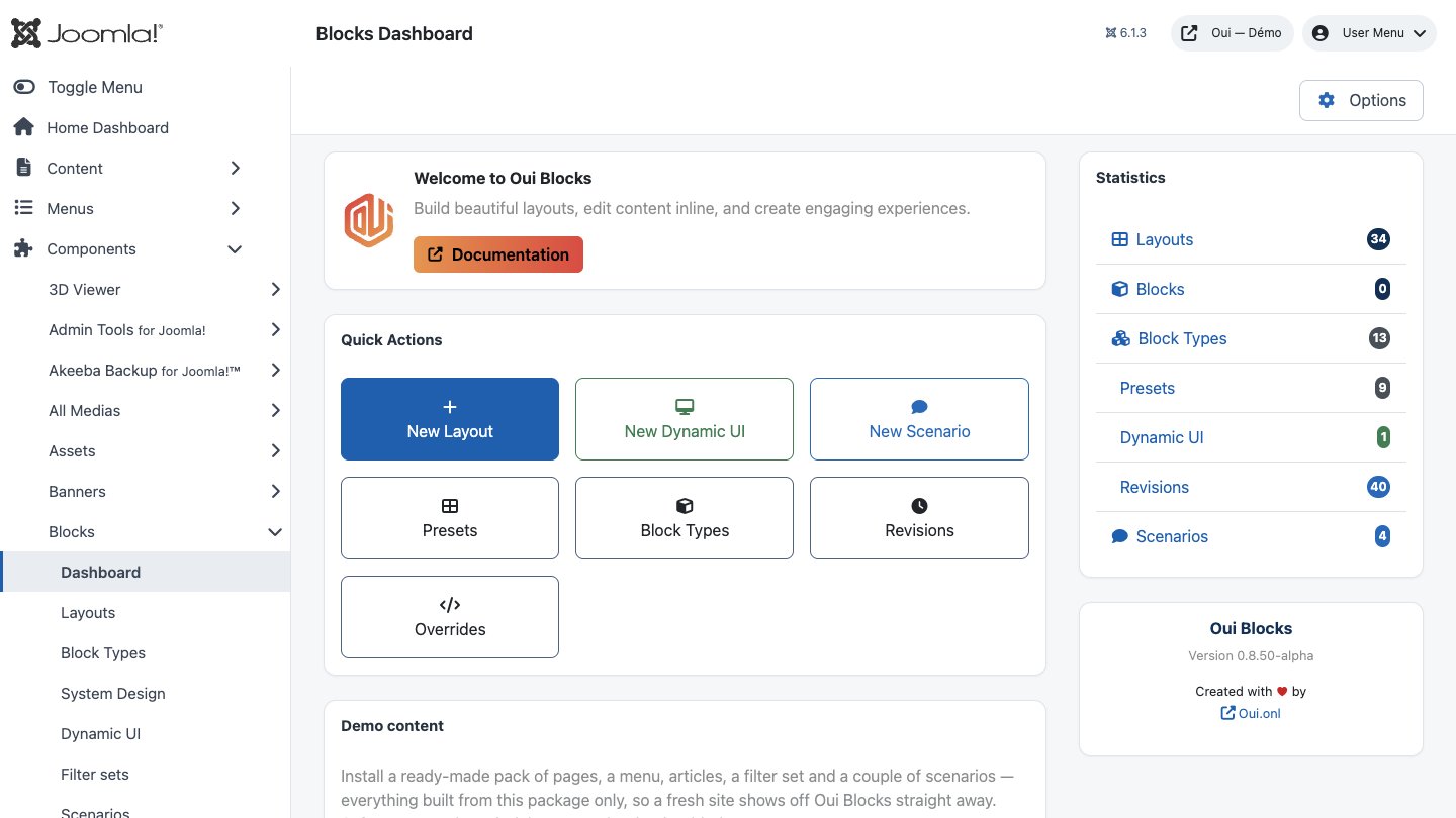
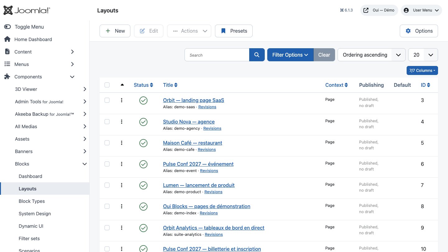
Everything is under Components → Blocks: Dashboard, Layouts, Block Types, System Design, Dynamic UI, Filter sets, Scenarios and Overrides. Presets and Revisions are opened where they are used: the dashboard's buttons, Presets in the Layouts toolbar (and the builder's Presets dialog), and the Revisions link under each layout in the Layouts list (that layout's saved versions, with Restore).
How pages reach your site
A layout is a page you build. It appears on the site in one of four ways, all standard Joomla:
| Where | How |
|---|---|
| A page of its own | Menu item of type Blocks layout |
| A module position | The Blocks module (mod_blocks), set to "A layout" |
| Inside an article | Type |
| With an article | A Blocks layout custom field (see section 8) |
For a full-width, modern page, give its menu item a template style with a fluid layout (Cassiopeia: Advanced → Layout → Fluid) and hide sidebar modules on it.
The builder
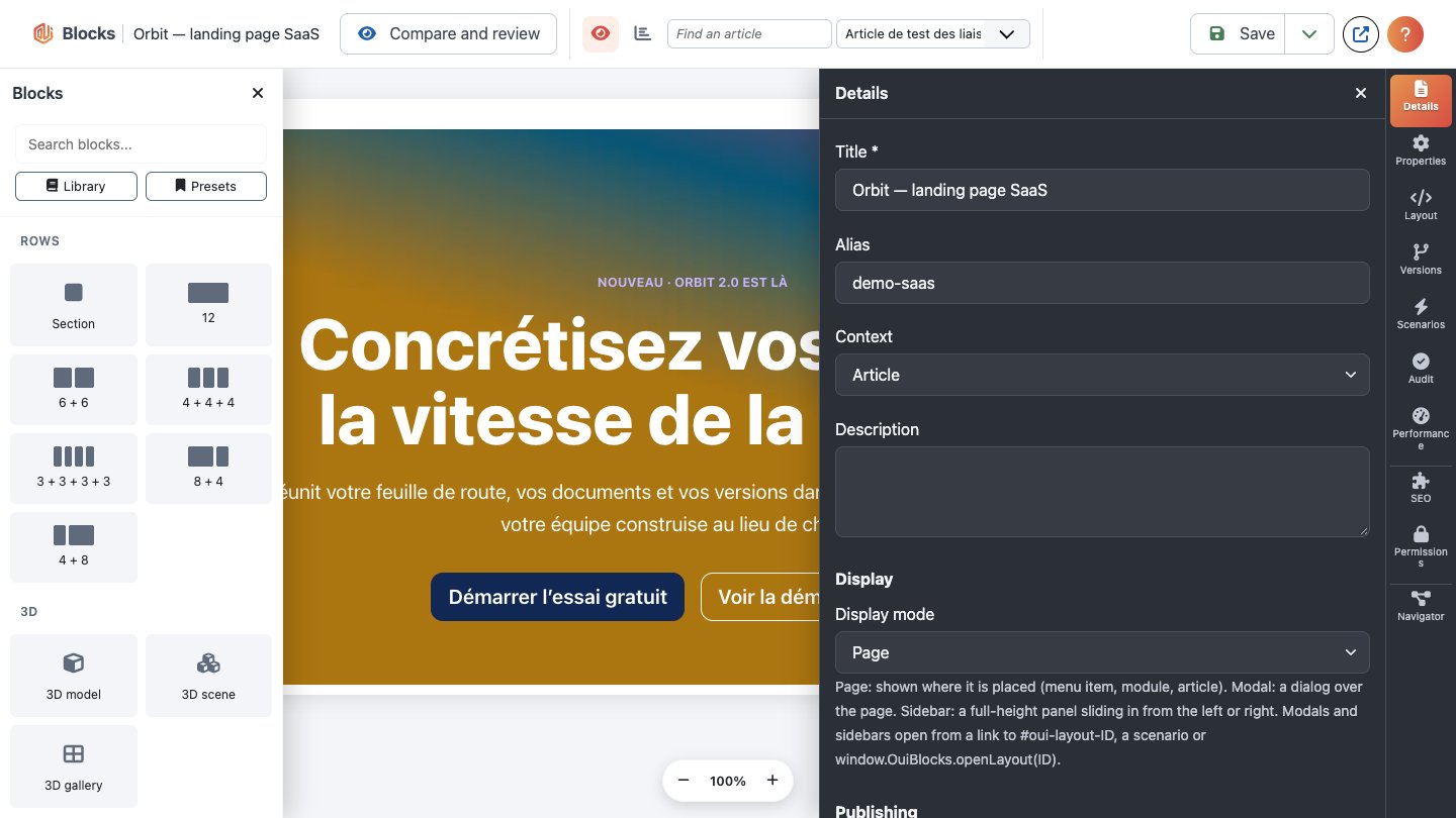
Each layout has one screen: open it from Components → Blocks → Layouts (its title) and you land on its first tab, Builder. Details holds all the layout's settings: title, alias, context and description; the display mode (Page, Modal or Sidebar, with the options of the chosen mode); and, in the right column, publishing (status, access, language, publish up and down, and with drafts on the draft's status), with the created and modified information below. Other extensions may add their own tabs after Details (an SEO extension, for example). Permissions comes last (administrators). The toolbar's Save saves both, the builder and the settings, in one step and without leaving the page (Ctrl/Cmd+S does the same); Save & Close saves then closes, Close leaves (and frees the layout for others). If someone else saved the layout meanwhile, nothing is written and you are told to reload. Documentation, at the far right, opens this guide in a new tab. Old links to the builder open this screen too.
Inside the Builder tab:
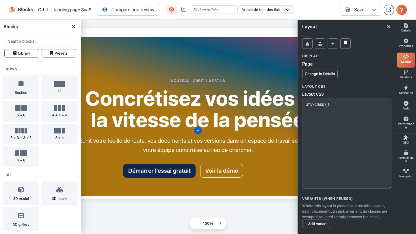
- Library (left): sections, row presets (12, 6+6, 4+4+4…) and every element type. Click to add after the selection, or drag onto the canvas.
- Navigator (bottom left): the whole tree. Click to select (Shift+click: a range, Ctrl/Cmd+click: add or remove one), drag to reorder: drop on the upper or lower part of an item to place before or after it, in the middle of a section or column to put inside it. It is fully keyboard operable (see Keyboard, multi-select and clipboard).
- Canvas (centre): the Live canvas by default, your real page as the site renders it, edited in place (see section 7); or Structure, the page as boxes. Both keep the selection in sync with the navigator and the properties.
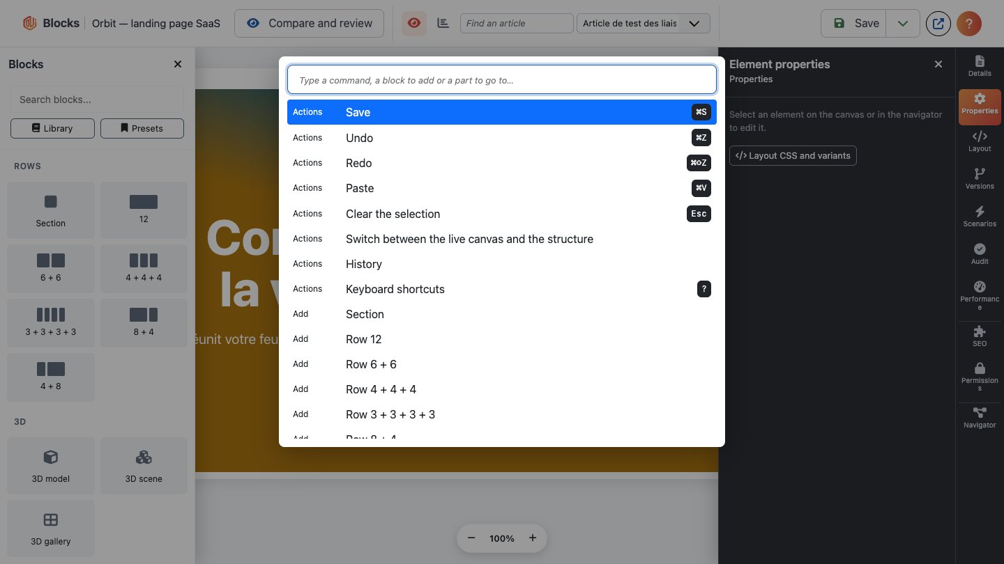
- The top bar keeps only what you use all the time: Compare and review, Live canvas / Structure (with the article to preview with), Save (its arrow holds the other ways to save), Preview (saves, then opens the page on the site in a new tab; a modal or sidebar layout opens in its dialog frame) and Help (?): the documentation, the command palette (Ctrl/Cmd+K) and the keyboard shortcuts (?). The template Library and the Presets open from the top of the blocks panel on the left. Under the canvas: the screen sizes (desktop, tablet, mobile, your site's other sizes and a width in pixels; styles apply to the size shown) and the zoom. Undo / Redo stay on the keyboard (Ctrl/Cmd+Z, Shift+Ctrl/Cmd+Z) and in the palette.
The side panels
The right side shows one panel at a time; the column of buttons at the far right (the rail) opens them, and clicking the open one folds the side away to give the canvas the room. The builder remembers your choice. Below 1200 px wide the panel lies over the canvas: Escape closes it.
- Properties (default): the selection's Content, Style and Advanced tabs. Choosing an element on the canvas or in the navigator brings this panel back.
- Layout: the display mode (a button takes you to it in the Details tab), the layout CSS and the variants used when the layout is reused elsewhere.
- History: every saved version; choose one to load it into the editor (see section 11).
- Import / Export: export the layout as a file, import an export or an SP Page Builder page, open the template Library, Save as template…, Presets and, in the administrator, Manage presets.
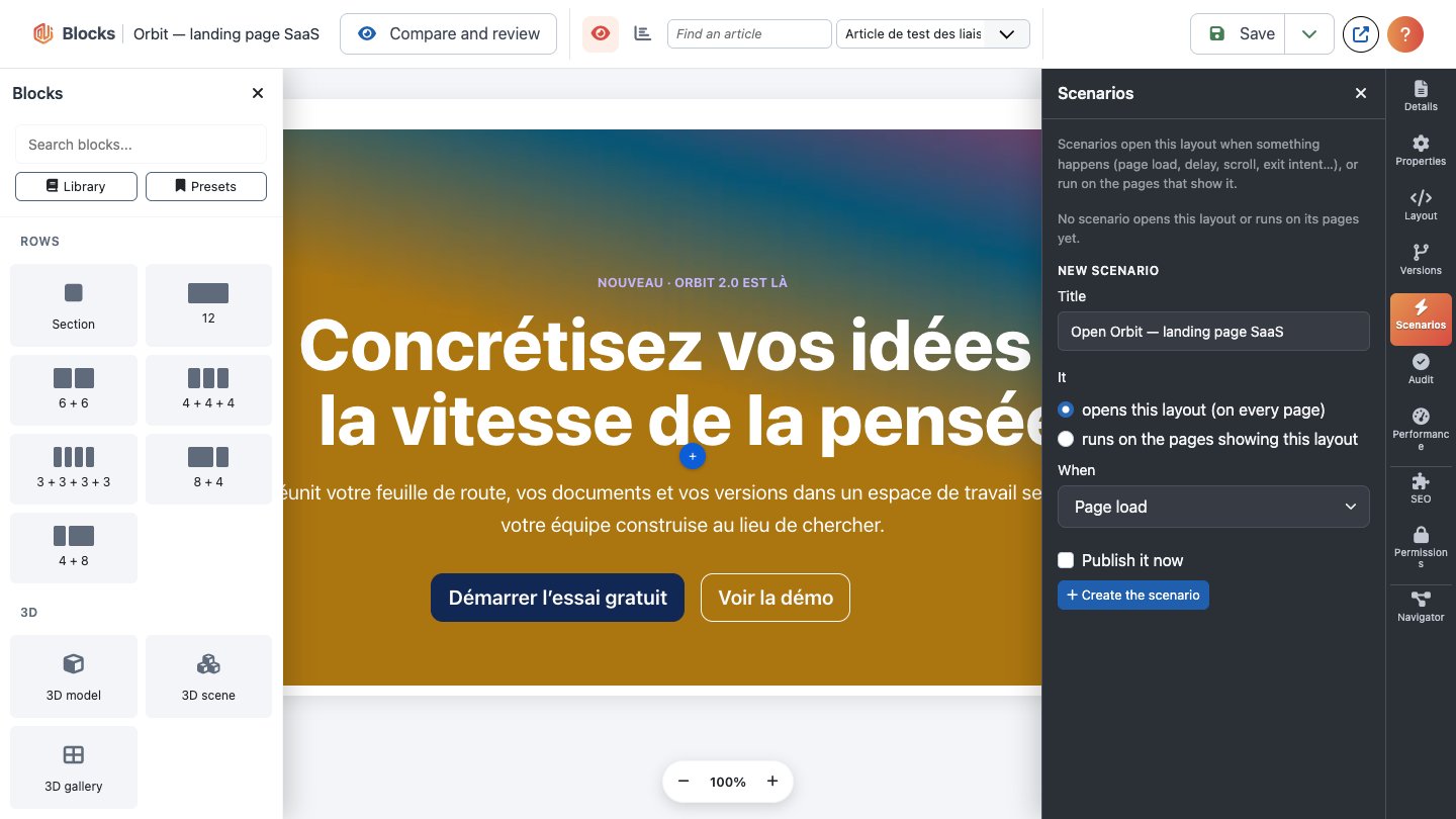
- Scenarios (administrator): the scenarios that open this layout or run on the pages showing it, each linked to its form, and New scenario: a title, whether it opens this layout or runs on the pages showing this layout (the pages are the menu items pointing at it), When (page load, delay, scroll, exit intent…) and Publish it now. It is created unpublished unless you tick that box (and may publish); open it to add conditions or more actions. Needs the Create permission.
- Audit and Performance: see Audit and structured data and Performance; each runs when you open its panel.
Sections, rows and columns
A page is a tree:
- Section: a band of the page. It can hold anything except columns. In its Content tab:
- HTML tag: section, header, footer, main, aside, article or div.
- Content width: full width, centred container, or full width with side padding. The background always stays edge to edge.
- Background image, background video (a self-hosted
.mp4or.webmfile, muted and looping, hidden for visitors who prefer reduced motion), overlay colour (e.g.rgba(0,0,0,.4)), image position and size. The image and video fields show a thumbnail next to the path; Select… opens Joomla's media manager in a dialog (images, or videos only), previews the file you click with its path and size, and Insert writes its path (images/demo/hero.jpg). Clear empties the field; both are one Undo step. You can still type a path or a URL. - Row: a Bootstrap grid row. It holds only columns.
- Column: a width from 1 to 12 (of 12). It holds anything except columns — including other rows, so grids can nest.
Elements
The core elements are Heading, Text (rich text, content plugins run on it), Image, Button (styles
primary, secondary, outline, light, outline-light, dark, link; sizes small/large), Spacer,
Divider, Video (YouTube or Vimeo privacy-enhanced embed, or a self-hosted .mp4/.webm with a
poster image), Module position, Reusable layout and Custom field (an article custom field, see
section 8).
Media fields — the Image's image, the Video's self-hosted file and poster, and any element field declared as media — have the same thumbnail, Select… and Clear as section backgrounds. Select… is shown to users who may use the media manager (Media: Access Administration Interface in the administrator; Create or Access Administration Interface on the site); others type the path and still see the preview.
Links accept full URLs, site-relative paths (/contact, images/x.jpg, index.php?…),
mailto:/tel: and in-page anchors (#pricing). Dangerous links (javascript:…) are refused.
Styling: classes and the System Design
Components → Blocks → System Design holds the site's design system. Everything is checked on the server when you save and compiled into one stylesheet: the same design always gives the same CSS.
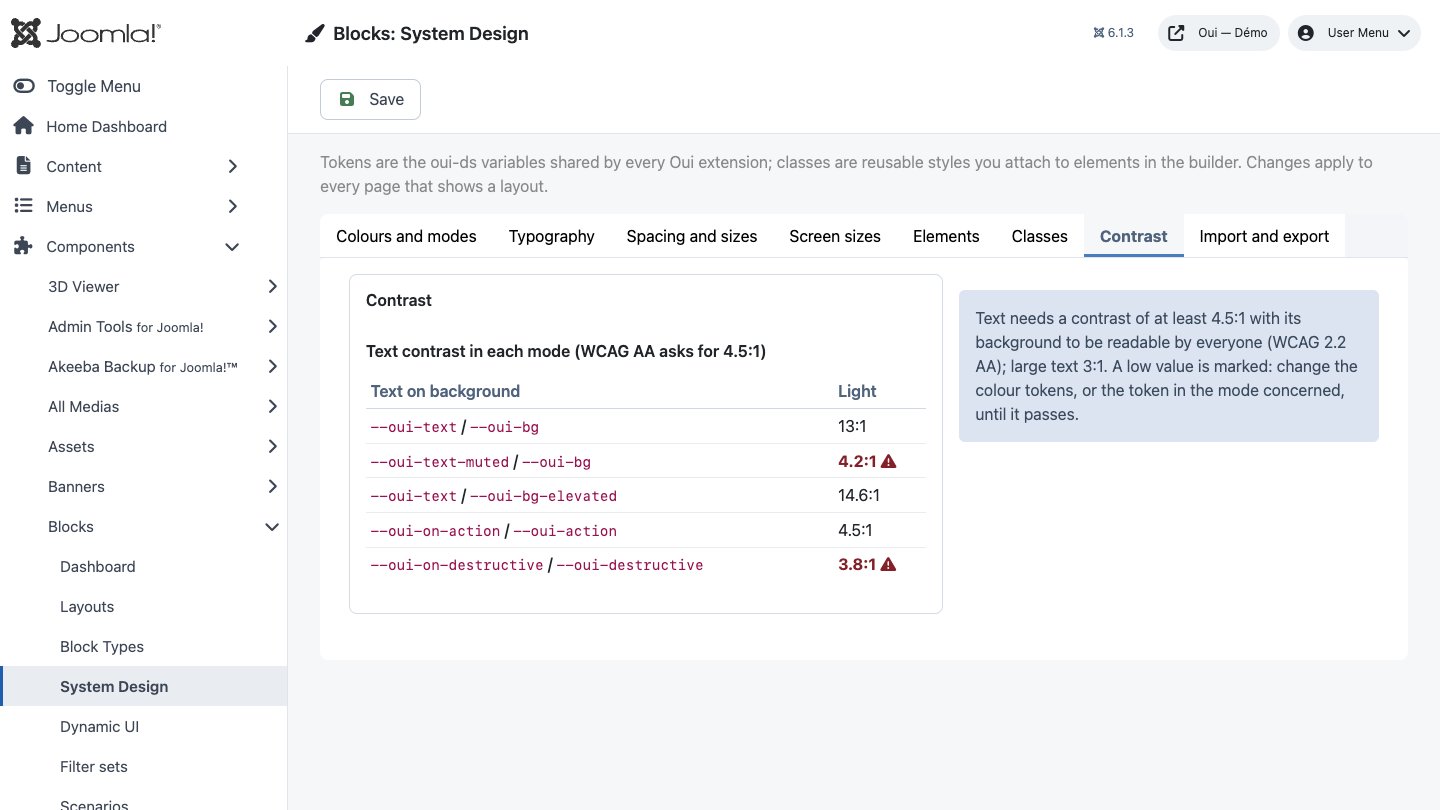
The screen is organised in tabs, with the settings on the left and what they look like on the right, updated as you type: Colours and modes (oui-ds colour tokens, your tokens, the modes | every colour in each mode), Typography (fonts, typography styles | a specimen of each), Spacing and sizes (sizes, spacing, radii, shadows | the scale drawn to size), Screen sizes, Classes, Contrast (the contrast table and what WCAG asks for) and Import and export. The open tab is remembered; Save saves every tab at once.
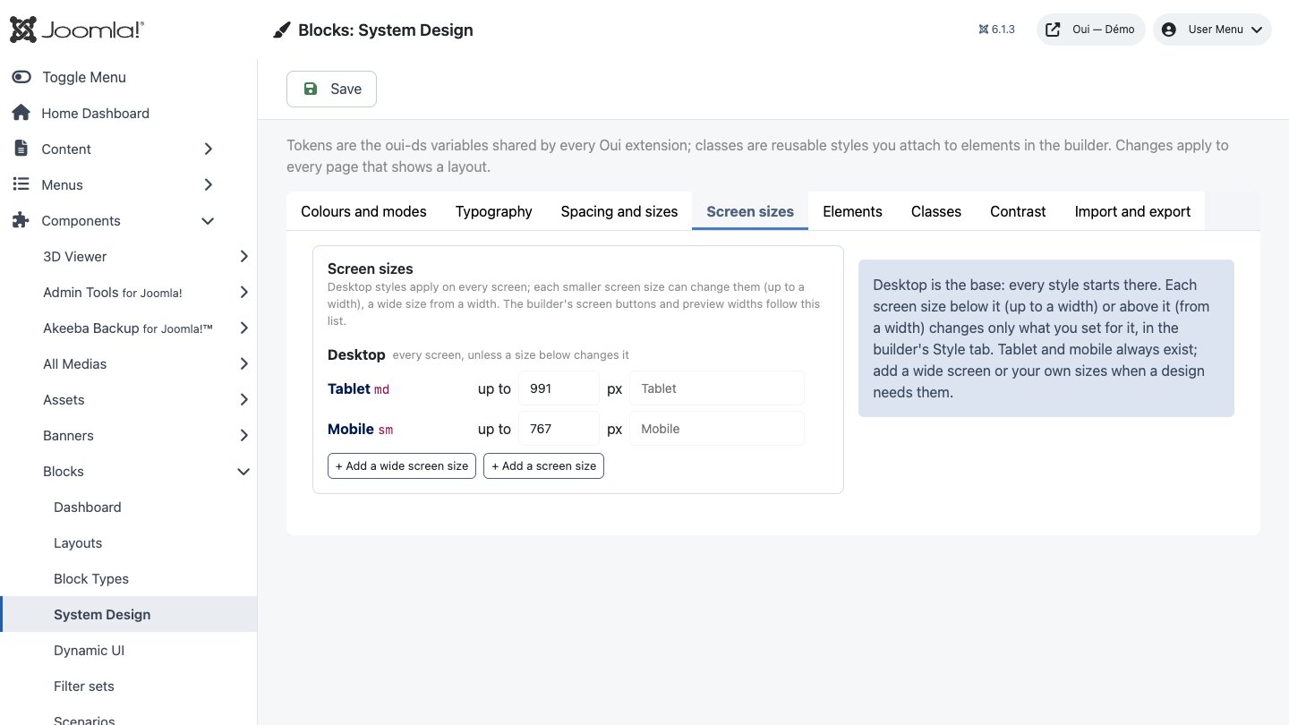
- Screen sizes: desktop styles apply everywhere; tablet (up to 991 px) and mobile (up to 767 px) can change them. Change those widths, add a wide screen ("from" a width, e.g. 1400 px) and your own sizes (e.g. "Small phone", up to 400 px). The builder's screen buttons and preview widths follow this list. A size you remove keeps its values on the elements; they apply again if you add it back.
- Your tokens: your own variables, e.g. a palette (
gray-900,brand-500) or fluid sizes (clamp(1.5rem, 4vw, 2.75rem)), used asvar(--oui-name). - oui-ds tokens: colours, fonts, sizes, spacing, radii and shadows (
--oui-primary,--oui-space-4…), shared by every Oui extension. A token can point to another token of the same type (--oui-text=var(--oui-gray-900)): change the palette once, every token that points to it follows. A token that points back to itself is refused. - Colour modes: Dark and High contrast change some tokens. A mode applies inside any
element with
data-oui-mode="dark"(or"contrast"), or to the whole site when Follow the visitor's system setting is ticked (prefers-color-scheme/prefers-contrast);data-oui-mode="light"keeps a part light. The contrast table checks text on background in every mode (WCAG AA asks for 4.5:1).
- Typography styles: named text styles (font, size, weight, line height, letter spacing, case, per screen size). Add one to an element like a class.
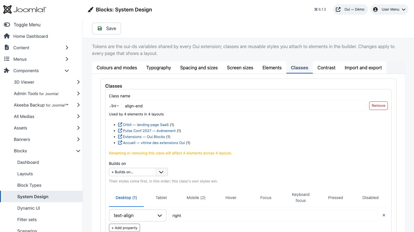
- Classes: reusable styles (
.bx-card,.bx-hero…) for every screen size and for the states Hover, Focus, Keyboard focus (:focus-visible), Pressed (:active) and Disabled. A class can build on other classes or typography styles: their styles come first, in order, and its own win (.bx-hero-titlebuilds ontitle). A class that builds on itself, even through others, is refused. Each class shows where it is used ("Used by N elements in M layouts") and warns before you rename or remove one that is in use. - Export design / Import design: the whole design (screen sizes, tokens, modes, typography styles, classes) as a JSON file. An import replaces what is on screen; nothing changes on the site until you save.
Values accept lengths, colours, keywords, var(), calc(), clamp(), min() and max();
anything else (url(), expression(), comments…) is refused, and flagged in red while you type.
In the builder's Style tab:
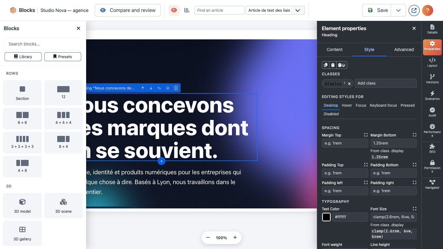
- Add classes (and typography styles) to the selected node; each chip shows how many nodes of the layout use it.
- With the System Design permission, click a class chip to edit that class right there. A banner reminds you the change applies everywhere the class is used; it is saved with the layout.
- Or give the node its own styles for the screen size shown (the buttons above the canvas, or type a width in px), or for a state. Token values are suggested as you type.
- Where a value comes from: under each property, "Set for Tablet", "Inherited from Desktop" or "From class .card", with the token's value when it is one. An empty field shows the value it inherits. Reset removes the value; Use on all screen sizes makes it the desktop value and removes the other sizes' ones.
- Fluid value (clamp) under spacing and font size fields: min, preferred (vw) and max give
clamp(1rem, 4vw, 2rem). - Contrast check: when the text and background colours are known from the design (own styles, classes, parents, tokens and what they point to), the Style tab shows the WCAG ratio in every colour mode and the canvas flags anything below 4.5:1.
Effects
The Advanced tab of a node has an Effects group. Effects are drawn by Oui Blocks on its
own wrappers (data attributes and one small script and stylesheet, com_blocks.effects, loaded
only on pages that use an effect). Nodes with effects show an Effects badge (wand icon) on the canvas,
and the live preview runs them. Motion — parallax, reveal, cursor, smooth scrolling — is switched
off for visitors who ask their system for reduced motion.
Sections
- Sticky: stays at the top of the screen, at a distance you choose. Inside a page layout it
uses CSS sticky; a header layout shown in a module position (
mod_blocks, Dynamic UI header) is held in place by the script instead, with a placeholder so the page does not jump. After Scrolled style after pixels it gets the classis-oui-scrolled(by default a solid background and a shadow; style it with your design classes). Hide when scrolling down slides it away going down and brings it back going up (never while the keyboard focus is inside). - Smooth scrolling to anchors on the page: links to
#anchorscroll smoothly and land below the sticky header (plus the extra offset). - Page colours while in view: while this section is under the header, the page's
<body>getsoui-scroll-darkoroui-scroll-lightand--oui-scroll-coloris set to the colour token you pick — e.g. a light header over dark sections:body.oui-scroll-dark .my-header { color: #fff }. - Cursor effect: a dot or ring follows the mouse over the section and grows over links, with an optional label ("View"). Desktop mouse only; the real cursor stays unless you tick Hide the real cursor (not recommended).
Sections and elements
- Parallax speed from -1 to 1 (0 = off): a section moves its background image or video, an element moves itself, a little slower (or faster, negative) than the page. Off on phones.
- Reveal on scroll: fade in, slide up/down/left/right or zoom in when it enters the screen, with a delay and duration in milliseconds, once or every time.
Elements
- Tooltip text (top, bottom, left or right; flipped to the other side at the screen's edge): shown on hover and on keyboard focus, closed with Esc, read by screen readers (the element or its own link becomes its trigger).
- Copy button: a Copy button under the element copies its text or a value you give (a promo code…) and says Copied.
Sections, columns and elements
- Link the whole box to: the whole box becomes clickable (full URL, site path,
#anchor, or#oui-layout-Nto open a layout as a modal — the same rules as button links). Links and buttons inside keep working. Open in a new tab addsrel="noopener noreferrer"and says so to screen readers; the link is named after the box's heading unless you give it a text.
Live preview
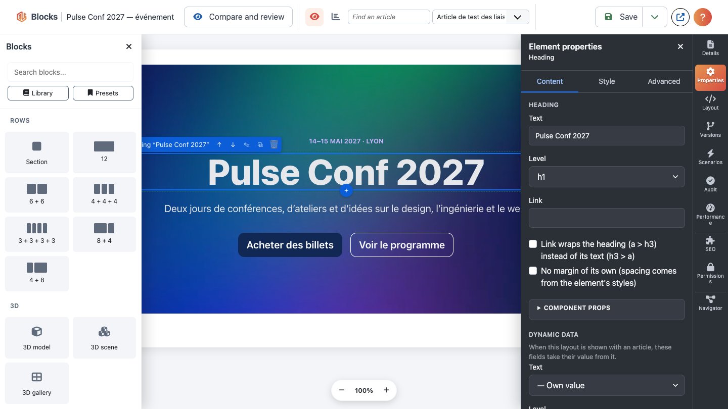
The builder opens on the Live canvas: the unsaved page on your real site, in its template, rendered by the same code as the published page, with real breakpoints at the tablet and mobile widths. It refreshes a moment after each change. Structure shows the page as boxes instead; the builder remembers your choice in this browser.
On the live canvas:
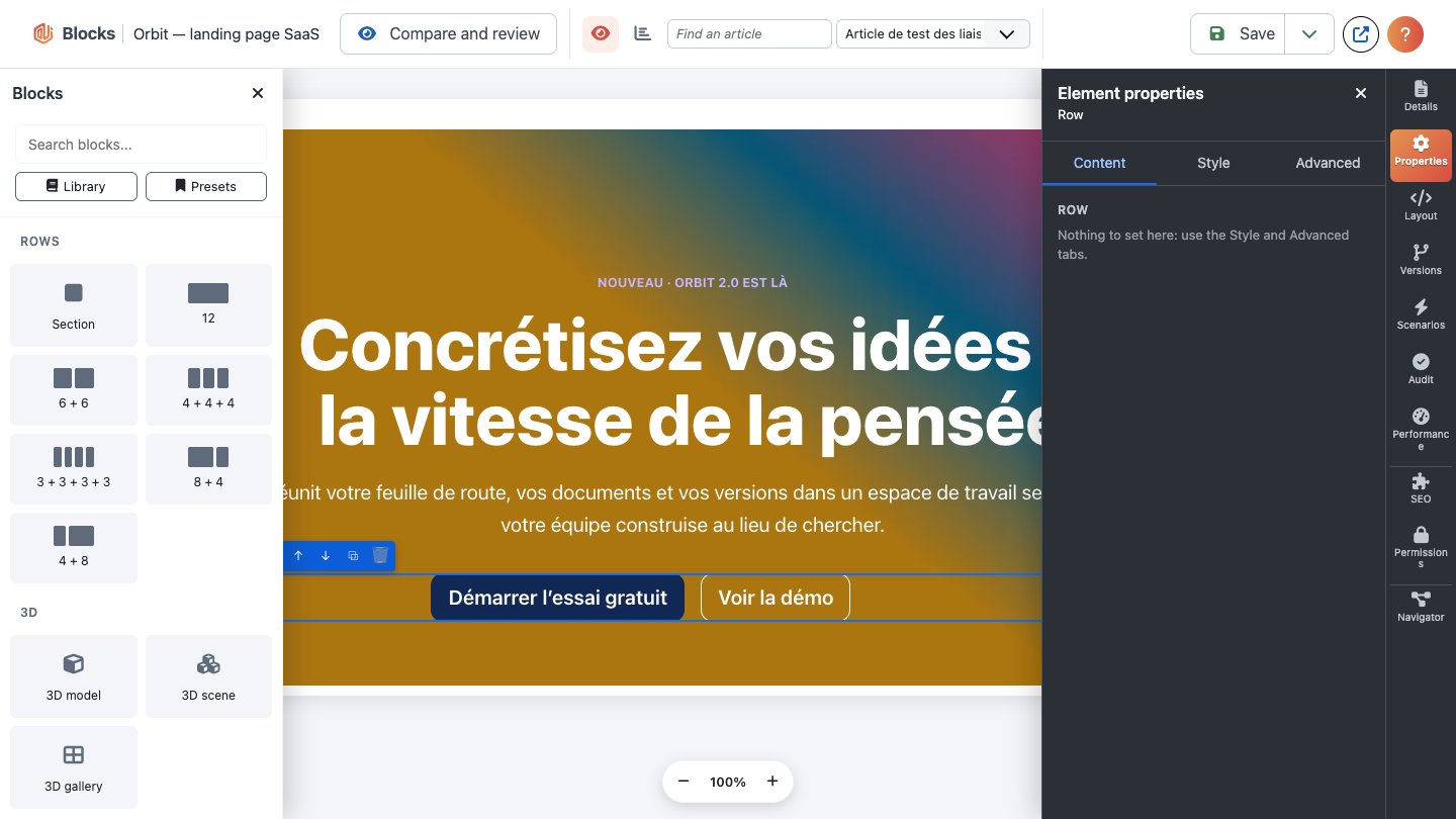
- Click a part to select it (Shift+click, Ctrl/Cmd+click to select several). The selection is outlined, with a small toolbar: the ⠿ handle to drag it (a green line shows where it will go; only places the structure allows are offered), move up/down, ✎ edit on the page, duplicate and delete. Hovering a part shows a + under it to add something right after it.
- Double-click (or Enter, or F2 in the navigator) to edit texts in place: headings, button labels and rich text (with the Bold, Italic, Link, lists toolbar; Alt+F10 reaches it; pasted text is cleaned, and the text is filtered on save like the Content tab). Enter ends a heading or a label, Escape ends any edit and brings the keyboard back to the navigator. An image opens a small panel: Select… opens the media manager, and its alternative text is edited there.
- Fields bound to dynamic data and locked parts are not edited in place. Other elements are selected on the canvas and edited in the properties panel, the canvas showing the result.
- An empty element shows a dashed placeholder with its name, so it can be selected and filled.
Preview as: see the page as yourself or as a member of any user group (Guest, Registered…), so restricted parts show or hide exactly as those visitors get them.
If the preview stays empty with a warning, your site forbids being shown in a frame: allow
X-Frame-Options SAMEORIGIN and Content-Security-Policy frame-ancestors 'self'.
Keyboard, multi-select and clipboard
Everything in the builder works with the keyboard. The navigator is a tree: Tab reaches it, ↑/↓ move and select, Home/End, → opens a branch or goes to its first child, ← folds it or goes to the parent, typing the start of a name jumps to it; Shift+↑/↓ select a range, Ctrl/Cmd+Space adds or removes one, Ctrl/Cmd+↑/↓ move the focus only. Enter goes to the settings of the part, F2 edits it on the live canvas. After any action the focus comes back to the part, and a screen reader announces what happened ("Heading moved into Section 2, position 1").
| Keys | Action |
|---|---|
| Ctrl/Cmd+K | Command palette: any action, Add a block (after the selection), Go to a part |
| ? | Keyboard shortcuts |
| Alt+↑ / Alt+↓ | Move up / down |
| Alt+→ / Alt+← | Move into the previous section, row or column / out of its container |
| Ctrl/Cmd+D, Delete | Duplicate, delete (every selected part) |
| Ctrl/Cmd+G, Ctrl/Cmd+Shift+G | Group the selected parts (same container) into a section, or into a row |
| Ctrl/Cmd+C, Ctrl/Cmd+V | Copy, paste after the selection (into another layout too, in this browser) |
| Ctrl/Cmd+Alt+C, Ctrl/Cmd+Alt+V | Copy the styles (classes and own styles of every screen size), paste them on the selection |
| Escape | Clear the selection |
The Style tab also has Copy styles, Paste styles and Paste for this screen only (only the styles of the screen size or hover state being edited). Pasted parts get new keys; anything pasted is checked (unknown element types, a column outside a row, invalid styles are left out), and locks are only kept for those who may set them.
Dynamic data and article layouts
An element's field can take its value from the article the layout is shown with. In the Content tab, Dynamic data lists each field with a source: the article's title, intro or full text, date, author, category, link, intro or full image, or any article custom field. Without an article, the element keeps its own value. Full text and full image stay hidden from visitors who may not read the article.
To attach a layout to articles:
- Content → Fields → New, type Blocks layout.
- In an article, pick a layout in that field.
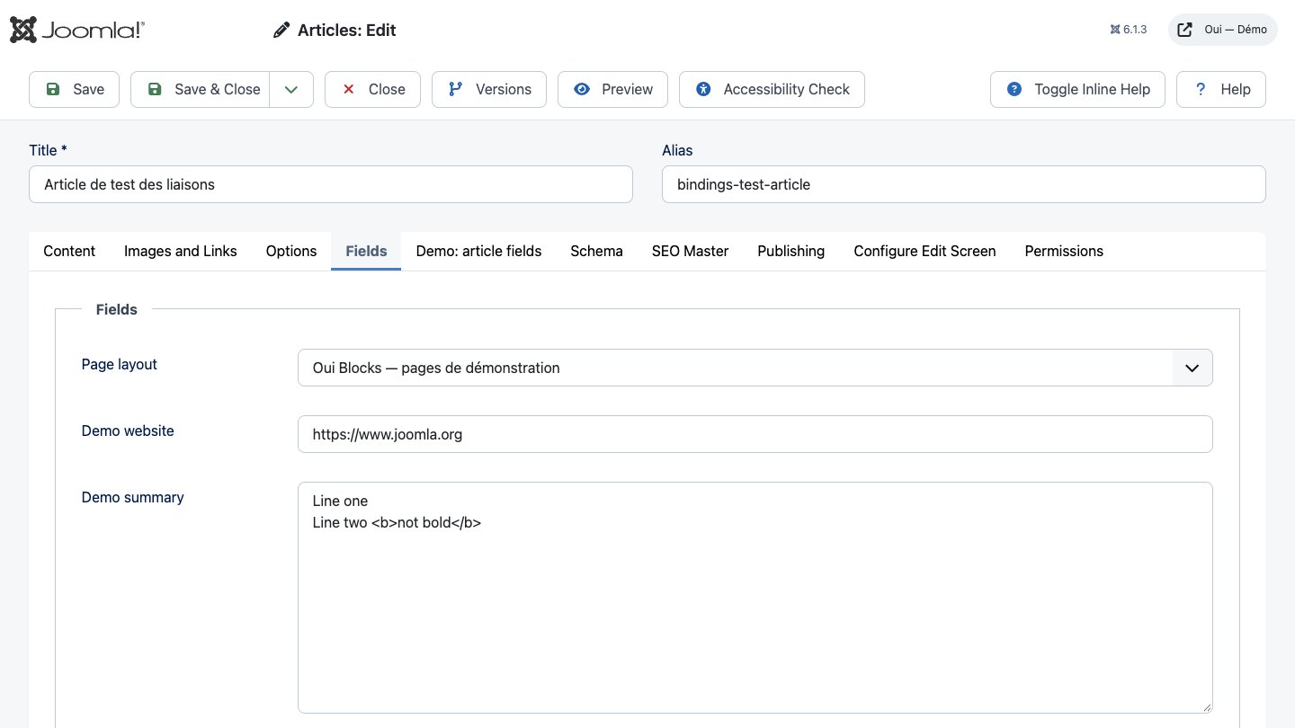
Joomla shows it where the field's Automatic Display option says. To show the layout instead of
the article body, use the opt-in alternative article layout in extras/article-layout.
Placing custom fields
The library's Article fields category lists every published article custom field as its own item (named after the field, with an icon for its type), plus a generic Custom field. Drop one where the value should appear and style it like any element. All field types work, including media, lists, calendar, subform, user and third-party types. Settings:
- Field: which custom field (grouped by field group).
- Label: as set in the field (Joomla's own field display: its "Show label" option, classes, prefix and suffix), above, inline or hidden; Label tag picks span, strong, div, p or h2–h6.
- Value: rendered by Joomla (the field type's layout, e.g. an image for media, the option labels for a list) or the raw stored value, for text-like fields.
- Text when the field has no value: shown instead of nothing (optional).
A field shows only to visitors allowed to view it (the field's and its group's access level), only
when the layout is shown with an article (the Blocks layout field, the alternative article layout,
or {blocks} inside an article) and only for articles in the field's categories.
Preview with article: in Live preview, pick an article (search by title) to see the layout with its real values. By default the newest article with custom field values is used; your choice is remembered for this layout in your browser.
Loops and conditions
Plugins "Oui Blocks - Content sources" and "Oui Blocks - Display conditions" (group
blockssource, installed and enabled with the package).
Loops
A Loop (library category Dynamic) repeats what you put inside it once per item of a source:
| Source | Items |
|---|---|
| Articles | published articles the visitor may see, with their custom fields |
| Categories | article categories (children of the chosen ones, or all levels below) |
| Tags | published tags |
| Contacts | published contacts: name, position, image, miscellaneous information, link (never e-mail, phone or address) |
Select the loop and, in its Content tab, pick the Source, the Number of items (up to 100), how many to Skip, the Columns (1 to 6; fewer on tablets and phones), the text shown When there is nothing to show, and Pagination: page links, or a Load more button (a real link to the next page: without JavaScript it simply opens it; with it the next items are appended, focus moves to the first new one and a screen reader hears how many arrived). Filter and order holds the source's own settings: for articles, category IDs (with or without subcategories), tag IDs, author IDs, featured, language, a date range or the last N days, leaving out the page's article, and the order.
Put elements inside the loop, then bind them to the item: in each element's Dynamic data, the group Loop item › Articles lists the item's values (title, intro text, link, images, dates, custom fields…) and those of its category and author (Category › Title…).
Nested loops. A loop inside a loop repeats a relation of the outer item: an article's tags or related articles (sharing a tag), a category's child categories or articles, a tag's articles (20 items at most per outer item, no pagination; two levels at most). On an article layout, a loop can also list a relation of the page's article (Of the page's article › Related articles).
What visitors see. Every query, counts and pages included, applies Joomla's rules for the visitor: published (workflow stages publish through the same state), inside the publish window, the article's access level and that of its category and of every parent category, and on a multilingual site the current language or All. Preview as in the builder shows exactly what that group would get. The live preview renders real items.
Cache. A loop is cached per view levels, language and template like the rest of the layout, separately per menu item (and per URL when paginated). A cached copy can show a scheduled article up to the cache lifetime late, as with Joomla's own caches.
Display conditions
Any section, row, column, element or loop can have Display conditions (Advanced tab). A node shows when every condition of at least one group is met: + And adds a condition to a group, + Or adds a group. Conditions are checked on the server before the page is sent: a hidden part is never in the page. The canvas marks conditional nodes with a Conditional badge.
| Condition | Settings |
|---|---|
| Visitor | logged in or not |
| User groups, View levels, Menu item | is one of / is none of (IDs) |
| Language | is one of / is none of (tags such as fr-FR) |
| Date and time | from / until (a date includes that whole day), weekdays, daily time range (site or visitor timezone); never cached |
| Field value | of the loop's current item or of the page's article: title, category.title, field.12…; equals, differs, contains, empty, not empty, greater, less (numbers compare as numbers) |
| URL parameter | a query parameter equals, contains, is empty… |
The visitor's device is not a server condition (a user agent is unreliable and pages are cached): use the node's per-device Visibility, which hides it with CSS. A condition from a disabled plugin hides its node rather than showing it to everyone.
Reusable layouts and component props
The Reusable layout element shows another layout inside this one. Edit it once in its own builder ("Edit this layout") and every page that uses it changes. Detach replaces it with an editable copy.
Component props: in the reused layout, open an element's Content tab → Component props and
give a field a name (e.g. headline). Each place that reuses the layout then lists that prop and
can give it its own value; empty means the layout's own value.
Variants: a reused layout can offer variants, named sets of class swaps. With no element
selected in its builder, Variants (when reused) → Add variant, name it (e.g. dark) and
choose classes to replace (card → card-dark; empty removes the class). Each place that reuses
the layout picks a Variant in its Component props; "As designed" keeps the classes as they are.
Who sees what: access, locks, preview as
- Access (Advanced tab): any node can be limited to a Joomla viewing access level. Restricted parts are never sent to visitors who lack the level; a restricted section hides everything inside it.
- Locks (for users with the Manage locks permission): limit who may edit a node to chosen user groups. A save that changes, moves or removes a locked node is refused with its path.
- Preview as in the live preview (see section 7).
History, export and import
All three are in the builder's side panels: History and Import / Export.
- History: every save keeps a version. Load one into the editor (one undo step); nothing changes on the site until you save.
- Export: downloads the layout as a JSON file, with the design classes it uses.
- Import: adds an exported layout at the end of the page (new keys, one undo step) and the design classes your site lacks. It also takes an SP Page Builder page export or a YOOtheme Pro layout file, converted like a migration (see Migrating from other builders), with a note for anything lost.
Template library
Library (in the builder's More menu and its Import / Export panel) opens every ready-made section and page your site has:
- the Oui Blocks starter pack (plugin Blocks templates - Starter pack): heroes, features, pricing, testimonials, FAQ, calls to action, a footer… and the six demo pages;
- packs from other
blockstemplatesplugins; - This site: templates saved from your own pages, and packs imported from a ZIP;
- Presets: the builder's presets, read-only (the Presets dialog still manages them).
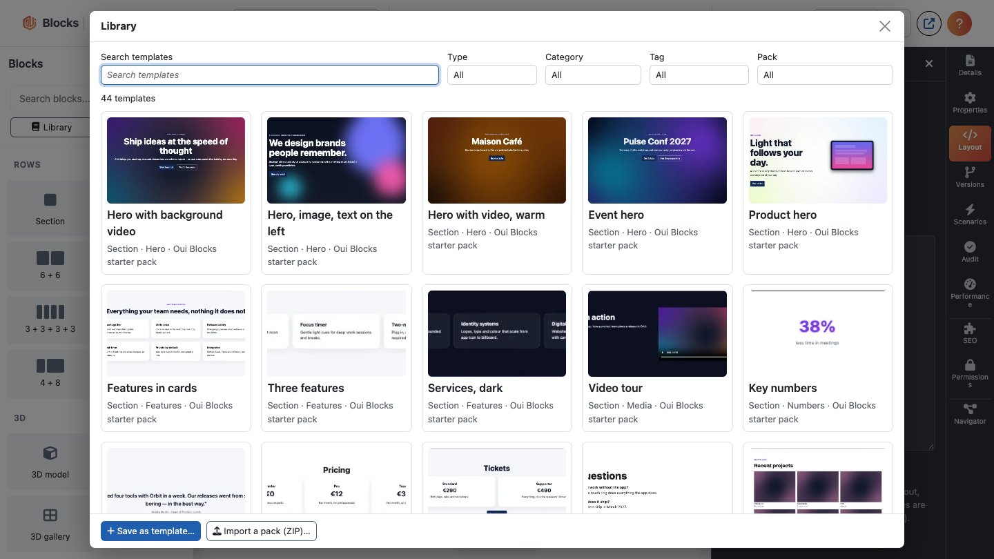
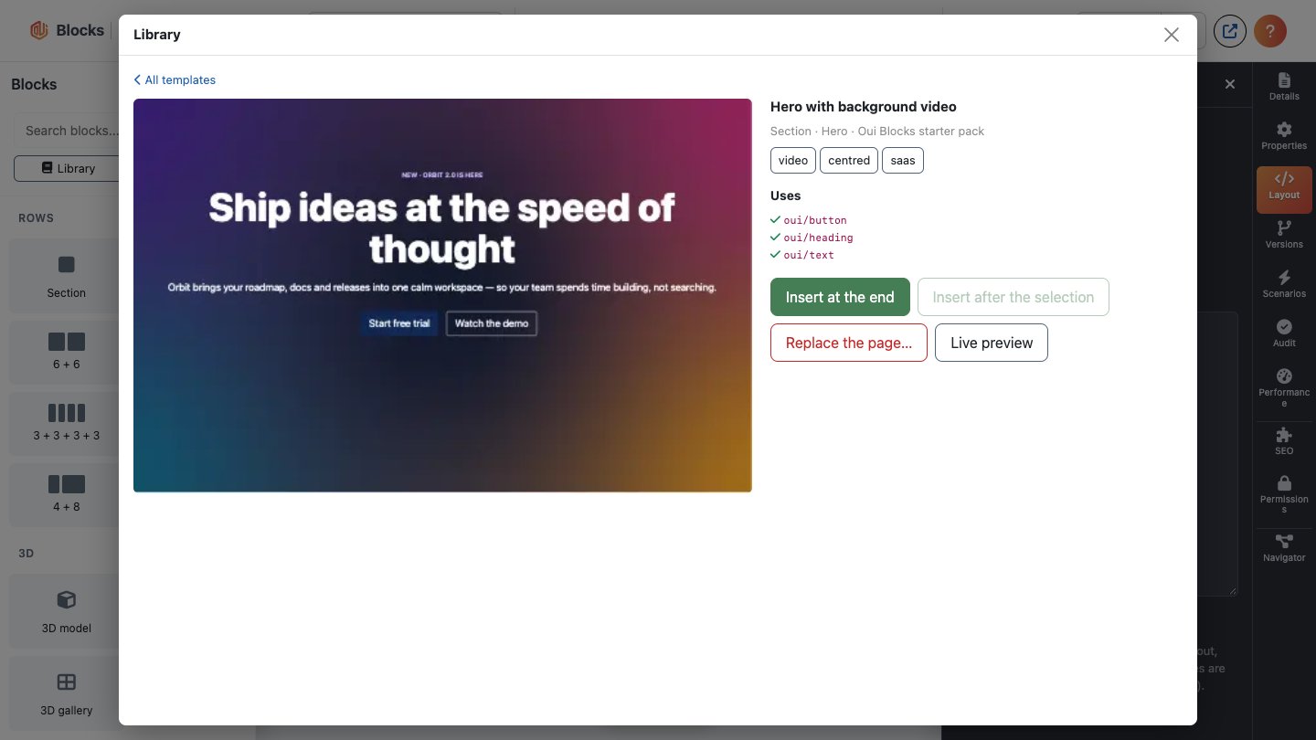
Search by title, category, tag or pack, or filter by type (page, section, block), category, tag and pack. Choose a template to see it larger, what it uses and Live preview (the template alone, rendered by your site with your design). Then:
- Insert at the end, or Insert after the selection (after the top-level section holding the selected node);
- Replace the page…: asks for confirmation in the dialog; Undo brings the page back.
Each insert is one undo step and gets new node keys. Like an import, the template's design classes that your site lacks are added to the System Design when you save (with the System Design permission); a class your site already has with other styles keeps your version, and a note lists it. Nothing changes on the site until you save the layout.
A template that needs an element your site does not have (a plugin not installed or disabled, e.g. Oui Forms for "Contact form"), or a newer Oui Blocks, is shown with the reason and cannot be inserted.
Save as template… (bottom of the dialog) saves the selected section or element, or the whole page, into This site, with a title, category, tags and an optional thumbnail (PNG, JPEG or WebP, 512 KB at most). Your own templates can be edited (title, category, tags, thumbnail) and deleted there. Saving needs Create on Oui Blocks, editing Edit (or Edit Own for your own), deleting Delete.
Export as ZIP downloads a site pack (manifest.json, templates/*.json, thumbs/*);
Import a pack (ZIP)… adds one to the library. An import accepts only JSON and PNG/JPEG/WebP
files in those folders (32 MB at most); every template is checked like a layout save. Importing a
pack again replaces its templates with the same id. A pack name used by a plugin is refused.
Dynamic UI: header, footer and side panels
Components → Blocks → Dynamic UI defines the areas around your pages: header, footer and off-canvas side panels. Each area shows a module position or a preset.
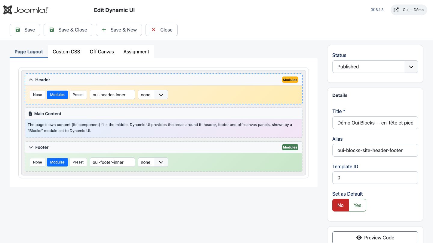
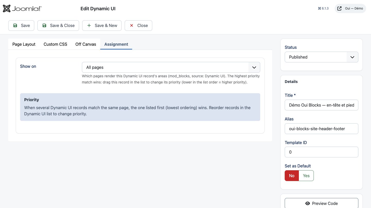
In the Assignment tab, choose where the record applies: on all pages, no pages, only the selected menu items, or all except them. When several records match a page, the first in the list wins (reorder them in the list).
To show an area, publish a Blocks module in a template position with Source: Dynamic UI and the area (header, footer, off-canvas left or right). Joomla's own module caching stays safe: the cache varies by visitor access levels, language, template and the matched record.
Filter sets
A filter set shows a list of articles that visitors narrow down with filters — category, tag, author, custom field, date or featured. The results update as they choose (or when they press Search), and only articles the visitor may read are ever listed or counted: published, inside their publishing dates, in the visitor's access levels and language, in a category they may see.
It takes three steps.
1. Create the filters. Components → Oui Blocks → Filter sets → New:
- Article Source: which articles to search — some categories (with or without their subcategories), some tags, or all articles.
- Filters: add, drag into order and remove the filters visitors will use. Each has a label, a
type (category, tag, author, custom field — pick a list, radio or checkboxes field —, date or
featured), a display (dropdown, multi-select, checkboxes, radio buttons; a date filter is always a
From/To range), the text of its "all" choice, CSS classes and a default value chosen on a
visitor's first visit (an id,
1/0for featured, a field value; several separated by commas). - Results: filters above the results, in a sidebar or in a row; live updates (Use AJAX; No: the form reloads the page and the filtered address can be shared); counts next to each choice; whether to show filters with no choice; results per page.
Every field has a description; the panel at the top of the screen recalls the three steps.
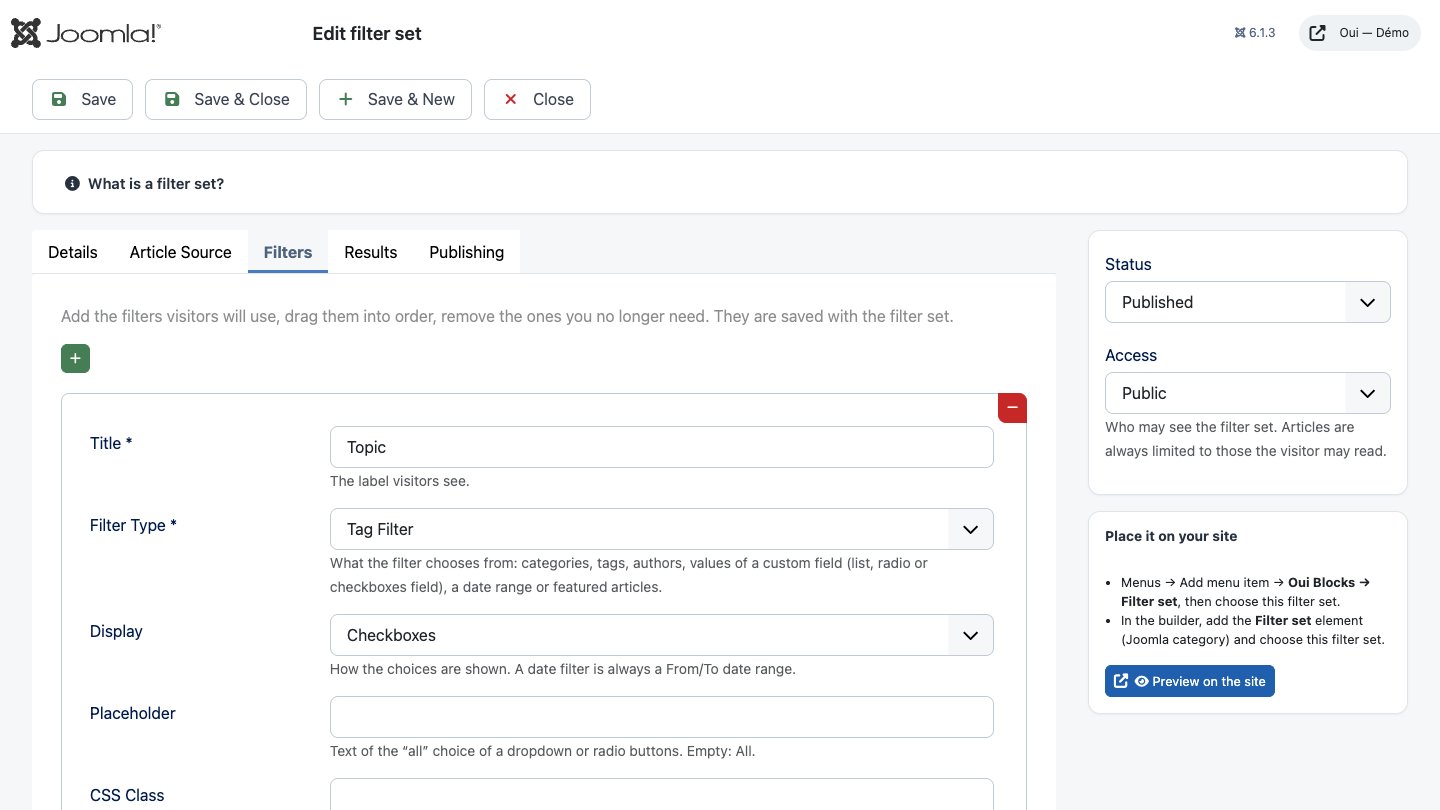
2. Place it on your site, in either of two ways:
- a menu item: Menus → Add menu item → Oui Blocks → Filter set, then choose the filter set. The page shows the filters and the results. Preview on the site (edit screen, right column) opens the same page without a menu item;
- the Filter set element (library category Joomla) in any layout: choose the filter set and where the results go — below the filters (the built-in list) or a Loop on this page (step 3).
3. Style the results. The built-in list shows simple cards (image, title, intro, date, category). To design your own:
- in a layout, add the Filter set element with Results: a Loop over "Filter set results" on this page;
- add a Loop (category Dynamic, see Loops and conditions) with the source Filter set results and the same filter set;
- design one card inside the Loop with dynamic fields (
item.title,item.image_intro,item.url,item.field.12…), then set its columns, empty text and pagination.
When a visitor changes a filter, the page asks the site for the filtered page and swaps the Loop in place (the address bar follows, so the result can be shared); without live updates the page reloads. Loops over Filter set results are cached per address.
To change the built-in markup instead, override the layouts in your template:
templates/<template>/html/layouts/com_blocks/advancedfilter/default.php (wrapper),
filters.php (the form) and items.php (the results). Keep the form fields named
filter[<filter id>].
Elements from other Oui extensions
Installing these Oui packages adds their elements to the builder library (enable their
Blocks - … plugin if it is not):
| Package | Elements |
|---|---|
| OuiForms | Form |
| OUI Poll | Poll / survey |
| Visualize | Chart / dashboard |
| 3D Viewer | 3D model, 3D scene, 3D gallery |
| DAM | Media (DAM) |
| Pay | Buy button, Product card |
| Assets | Gallery |
| All Medias | Media gallery |
Each renders only published items the visitor may view, and loads its scripts and styles only on pages that use it.
Oui Widgets
The Blocks - Oui Widgets plugin (installed and enabled with the package) adds seventeen elements
in the Oui Widgets category of the library. They are styled with your classes like any
element; each one loads its own small stylesheet and script only on pages that show it, and
templates can override its layout at templates/<template>/html/layouts/blocks/widgets/<name>.php.
Every animation stops for visitors who ask their system for reduced motion, and everything works
with the keyboard.
| Element | What it does | Main settings |
|---|---|---|
| Animated counter | Numbers count up when they scroll into view (the final value is in the page) | Counters (number, prefix, suffix, label), columns, duration, thousands separator |
| Text animation | A heading or text appears word by word, letter by letter, as a reveal or a typewriter | Text, tag, effect, start (in view or on load), duration, delay, replay, link |
| Image comparison | Before / after images with a divider you drag or move with the arrow keys | Two images and their alternative texts, labels, orientation, position |
| Image box slider | A carousel of cards (image, subtitle, title, text, button) | Slides, slides per view, auto-rotation and interval, loop, arrows, dots, label |
| Testimonial slider | A carousel of quotes | Testimonials (quote, name, role, photo, stars), same carousel options |
| Masonry grid | Images, or the latest articles of a category, in a masonry grid | Source, images, category, number, order, intro, date, columns |
| Framed gallery | Pictures in frames: a passe-partout, a frame graphic on top, or a border image | Images, frame, frame graphic, columns, tilt |
| Horizontal scroll | Panels that move sideways while the page scrolls down (a swipe row on phones) | Panels (title, text, image, button), mode (pinned or swipe), label |
| Scroll video | A video that plays forward and back with the scroll, with text cards | Video, poster, scroll length, fit, text cards (shown from a % of the scroll) |
| Logo | The template's logo and site title, or your own logo with a dark-mode version | Source, images, alternative text, site name, link, width, shrink on scroll |
| Map | An OpenStreetMap map with markers and a list of places | Markers, centre, zoom, height, ask for consent, wheel zoom, list |
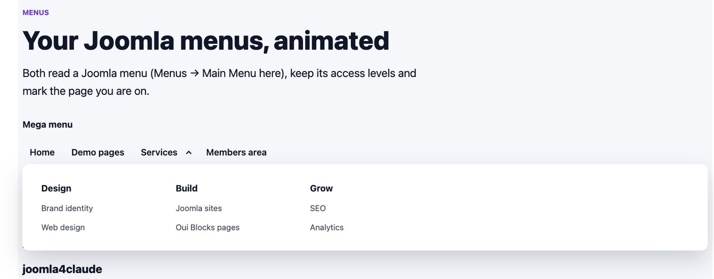
| Mega menu | A Joomla menu as a mega menu (columns) or dropdowns, with a mobile toggle | Menu, start level, levels, style, label |
| Animated menu | A Joomla menu with an animated underline, a sliding pill or a drawn circle | Menu, start level, effect, direction, label |
| Product 360° | Turn a product from a sequence of photos; optional link to an Oui Pay product | Folder of photos, alternative text, first photo, auto-spin and speed, product |
| Background audio | Background music the visitor starts with a button | Audio file, label, volume, loop, position |
| Instagram feed | Your latest Instagram posts | Number, columns, captions, refresh, profile link |
| Price list | Prices by category: a restaurant menu with dotted leaders, cards or a compact table | Prices (category, name, description, price, previous price, unit, badge, image), style, columns, currency, number format, cents, heading level, notes |
Lists. Slides, testimonials, images, panels, markers and counters are lists: + Add adds a row, and each row has move up, move down and remove buttons.
Menus. The mega menu and the animated menu read a Joomla menu (Menus → your menu) the way
the Menu module does: published items the visitor may view (and Preview as counts), items
hidden from menus left out, headings and separators as plain text, the current page marked
(aria-current). Submenus open with their own button (keyboard: Enter, Escape closes); under
992 px the menu folds behind a Menu button.

Sliders. Buttons, dots, the arrow keys, Home and End, and swipe. Auto-rotation is off by default; when on, it shows a stop button, pauses while the pointer or the focus is inside, and never runs with reduced motion. Screen readers are told about slide changes only when the rotation is stopped.
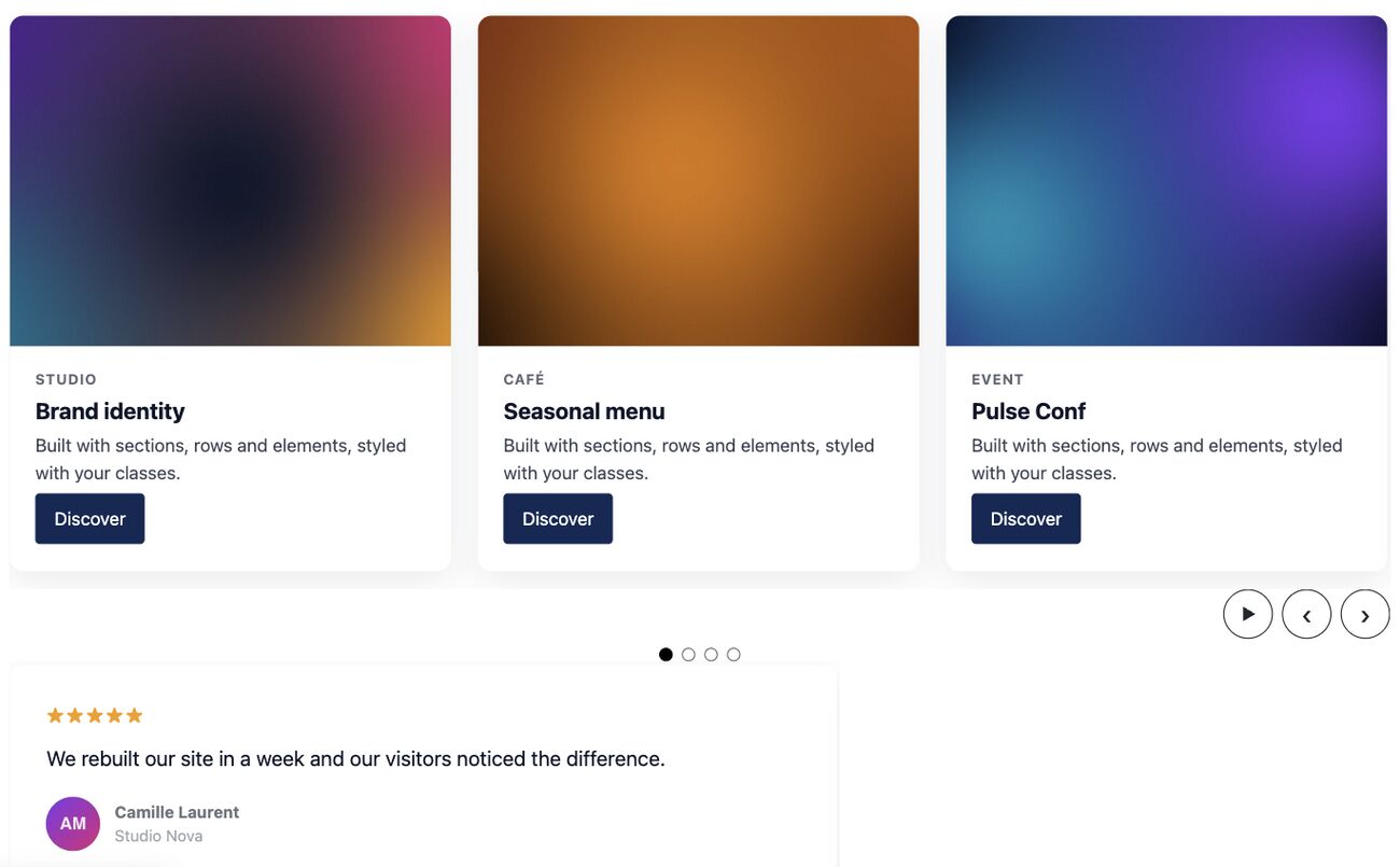
Map and privacy. Leaflet ships with the plugin; nothing is loaded from a CDN and no API key is
needed. With Ask before loading the map (on by default) the visitor first sees a note and a
Show the map button: no request goes to OpenStreetMap before that click, and the choice is
remembered in that browser. If your site sends a Content-Security-Policy, allow the tiles with
img-src https://tile.openstreetmap.org (System → Plugins → HTTP Headers).
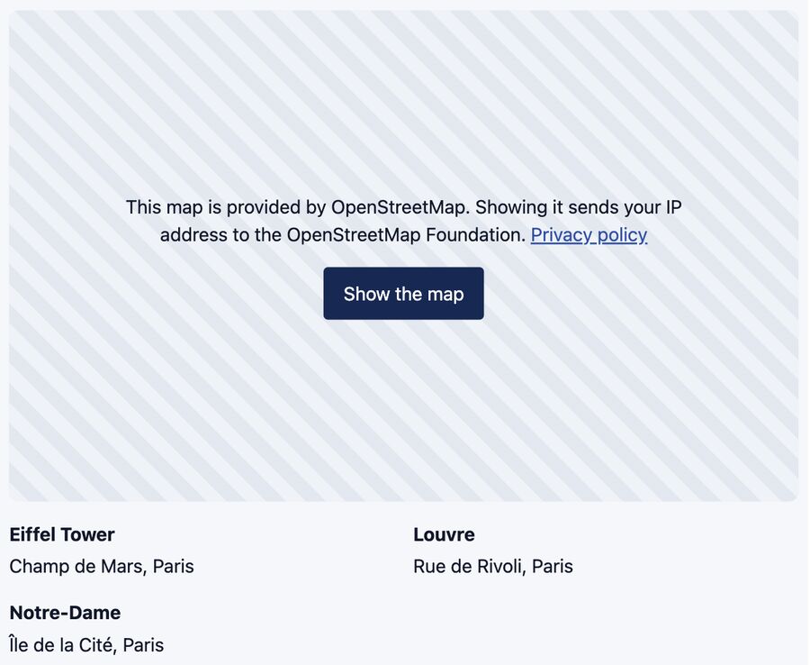
Instagram. Paste a long-lived Instagram API token in System → Plugins → Blocks - Oui
Widgets. It is stored encrypted with your site's secret, used only by the server and never
written into pages. Posts are fetched with a 5-second timeout and cached (1, 6 or 24 hours; a
failed call is retried after 5 minutes); without a token or posts the element shows nothing on
the site and a hint in the builder. Instagram images come from Instagram's servers: allow
img-src https://*.cdninstagram.com if you use a Content-Security-Policy. Tokens expire after 60
days unless refreshed.
Scroll video. Scrubbing needs a video with frequent keyframes, for example
ffmpeg -i in.mp4 -an -g 4 -bf 0 -crf 28 -movflags +faststart out.mp4. With reduced motion it is
a normal video with controls and the cards are listed under it.
Product 360°. Put the photos in one folder inside images/ (named so they sort in order,
e.g. frame-01.jpg … frame-36.jpg) and enter that folder. Drag, the arrow keys or the buttons
turn the product.
Background audio. Never plays on its own: the visitor presses the button (browsers block sound that starts by itself anyway).
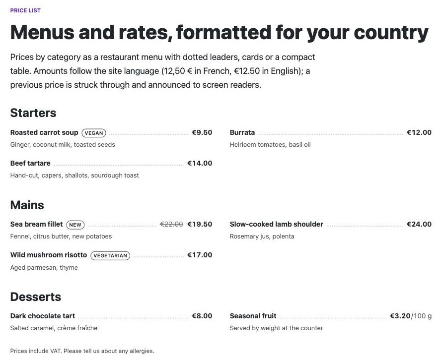
Price list. One row per item. A row's Category starts a new group with that heading;
leave it empty to keep the row in the group above (so a menu is "Starters: 3 rows, Mains: 3 rows",
typed top to bottom). Prices typed as numbers (12, 9.50, 9,50, 1 200) are formatted in
the chosen Currency (EUR by default) for the site language, or for the Number format you
enter (fr-FR gives 12,50 €, en-GB gives €12.50); anything else (On request, Free) is
shown as typed. Cents on Automatic shows cents on every price as soon as one price has them,
so the column lines up. A Previous price is struck through and announced as "Previous price"
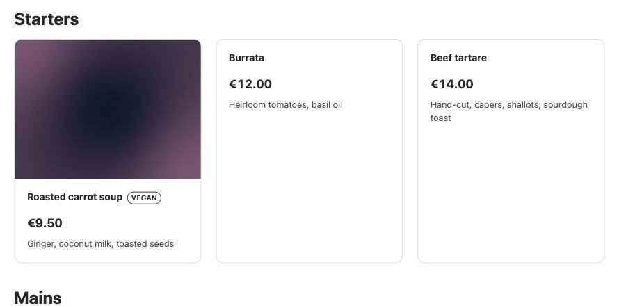
to screen readers; the Unit follows the price (/h, /kg, per person). Styles: List with
dotted leaders (the menu look, in 1 to 4 columns), Cards (the optional image on top) and
Compact table (one table per category, the category as its caption). Notes go under the
list (VAT, allergens). Colours come from the text colour, so it works on dark sections. Local
number formats need PHP's intl extension (present on most hosts); without it prices read
12.50 EUR. Structured data for search engines (off by default) adds schema.org JSON-LD
inside the element, like the structured data elements: a Restaurant menu (Menu → MenuSection →
MenuItem with its Offer) or Services or products (an OfferCatalog of Offers); prices typed as
text give an item without a price.
Phones. Every widget fits a 390 px screen: sliders show one slide, the horizontal scroll becomes a swipe row, the mega menu folds.
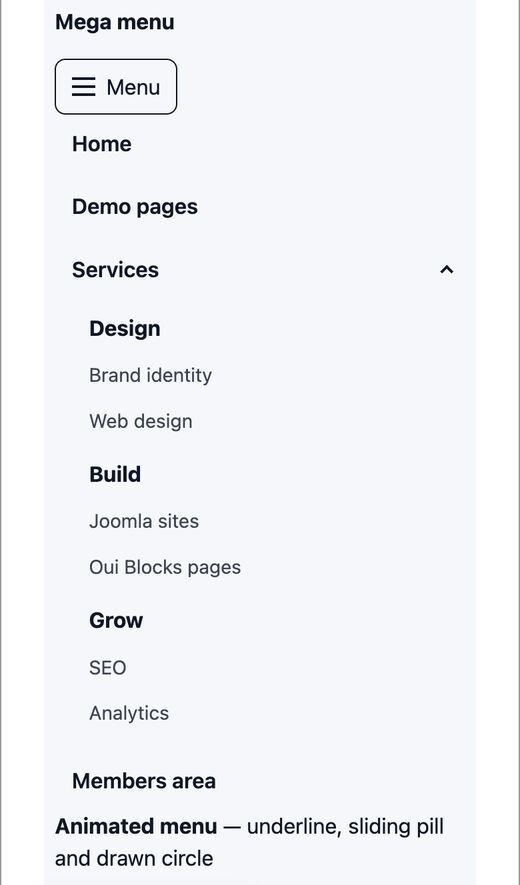
The demo page extras/demo/demo-widgets.json shows all of them (see Demo pages).
Demo pages
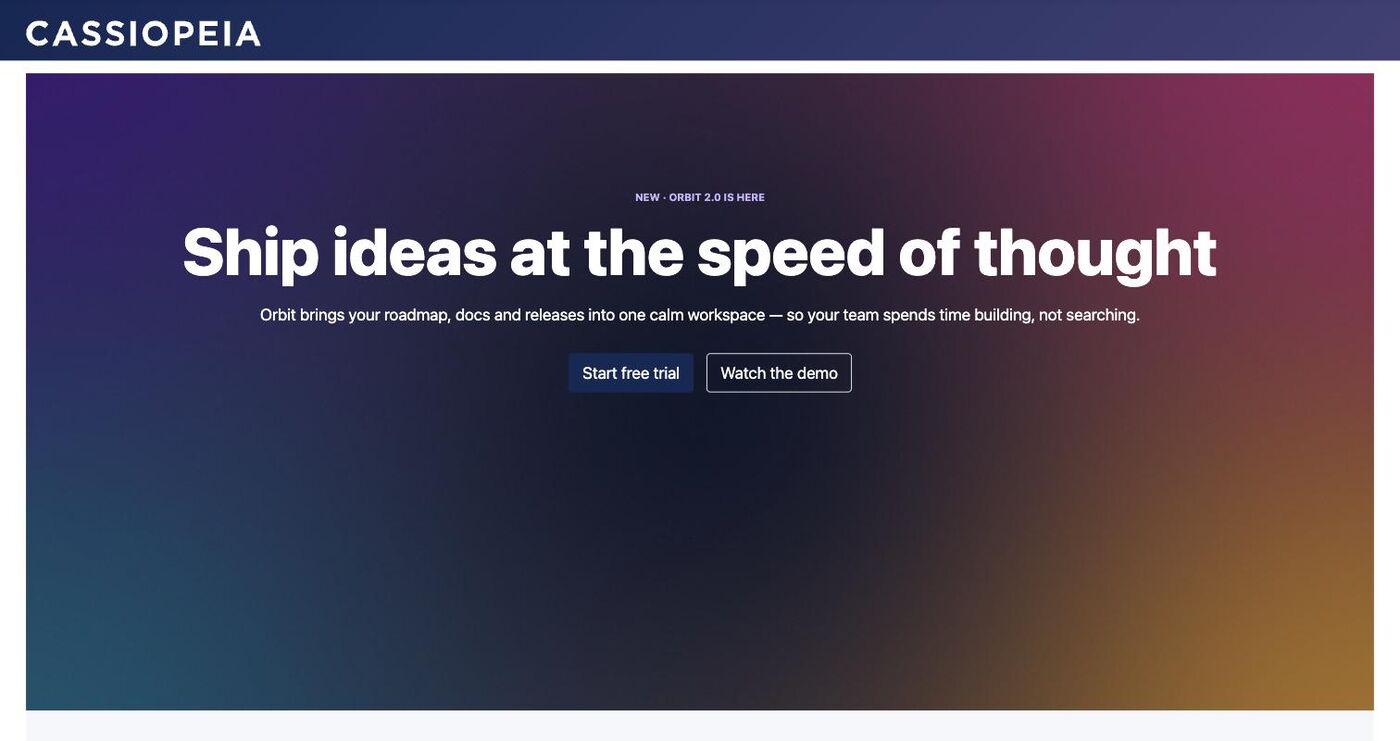
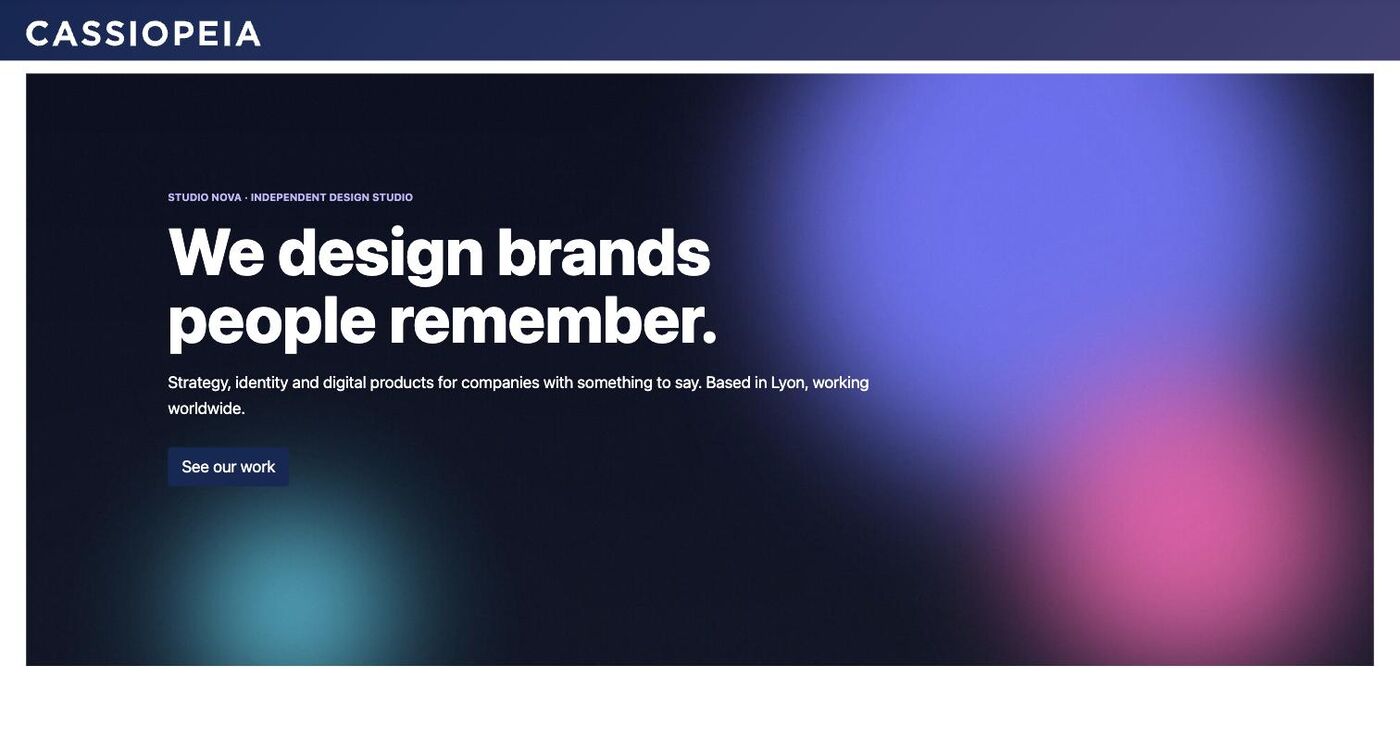
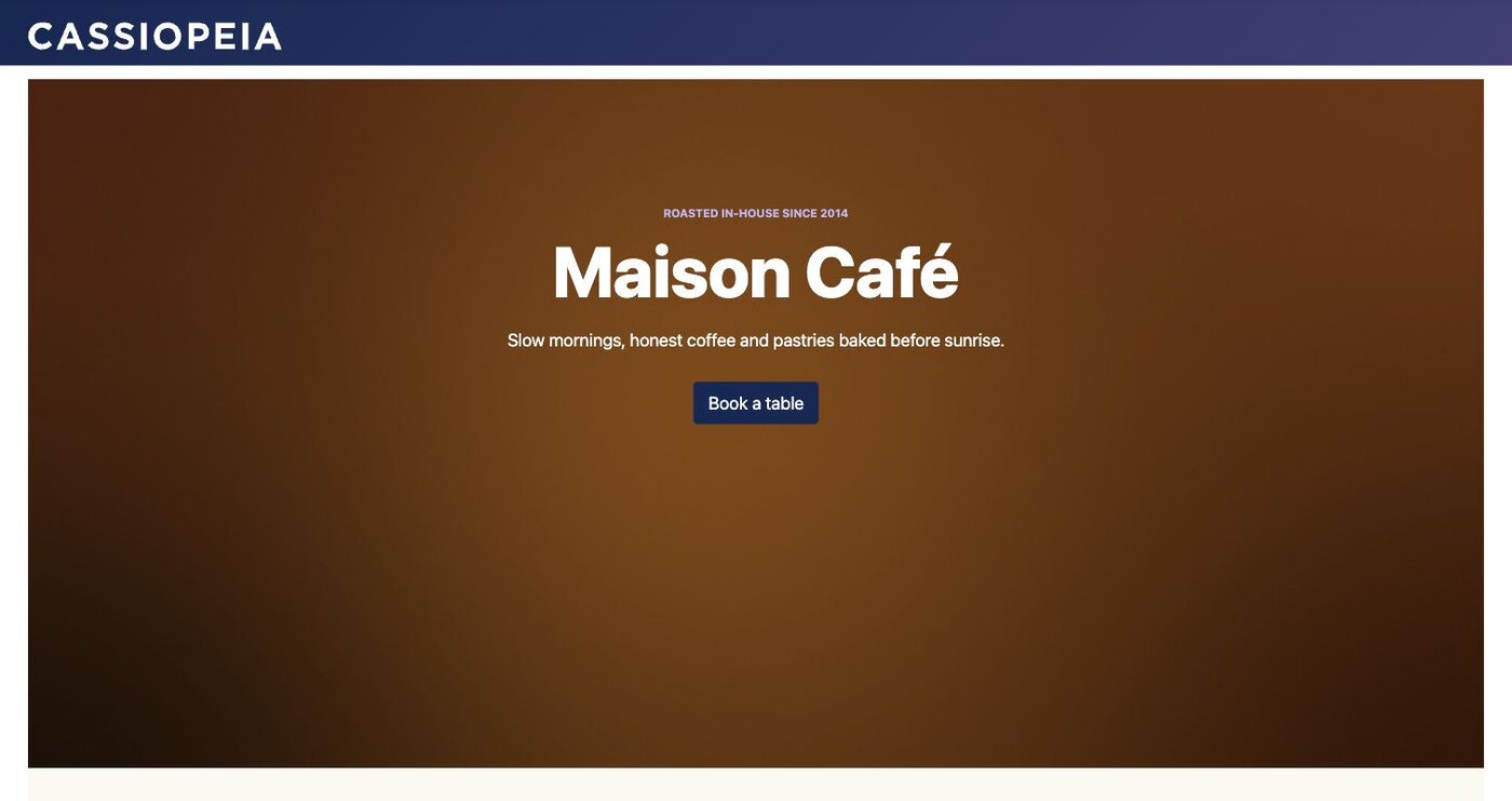
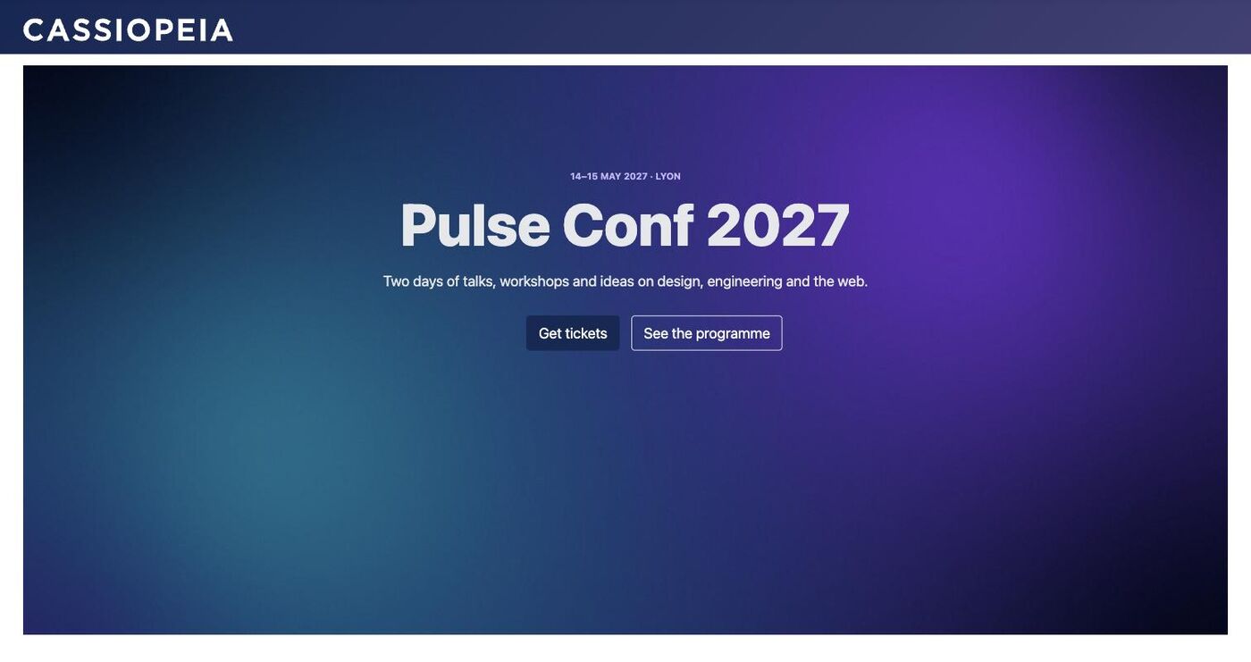
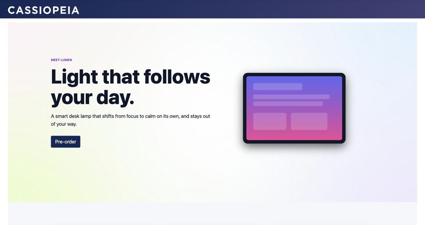
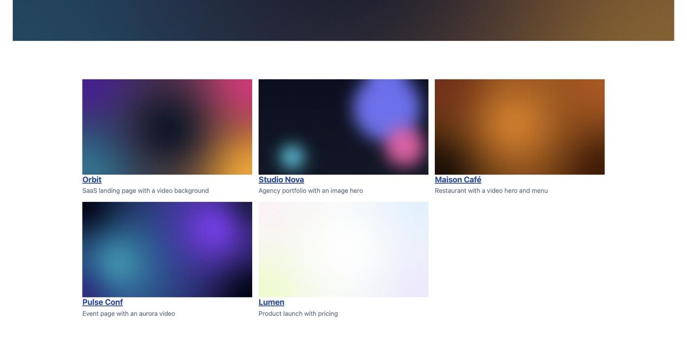
extras/demo contains six modern pages (SaaS landing, agency, café, event, product launch and an
index) with background images and videos, and demo-widgets.json, a page showing every
Oui Widgets element. See its README to import them.
Pages using the other Oui extensions
extras/demo/suite has four more pages built with the elements from the other Oui extensions,
and an index. An installer creates sample content in each extension (forms, surveys,
dashboards, 3D models, DAM images, products, albums), then the pages:
php extras/demo/suite/install.php /path/to/joomla --template-style=13
| Page | Elements |
|---|---|
| Northwind Studio — 3D showroom | 3D scene, 3D models, 3D gallery, DAM media, form |
| Pulse Conf 2027 | Buy button, product card, form, poll, All Medias gallery |
| Orbit Analytics | Visualize dashboards, product cards, buy button, survey |
| Atelier Lumière | Assets gallery, DAM media, All Medias gallery, form |
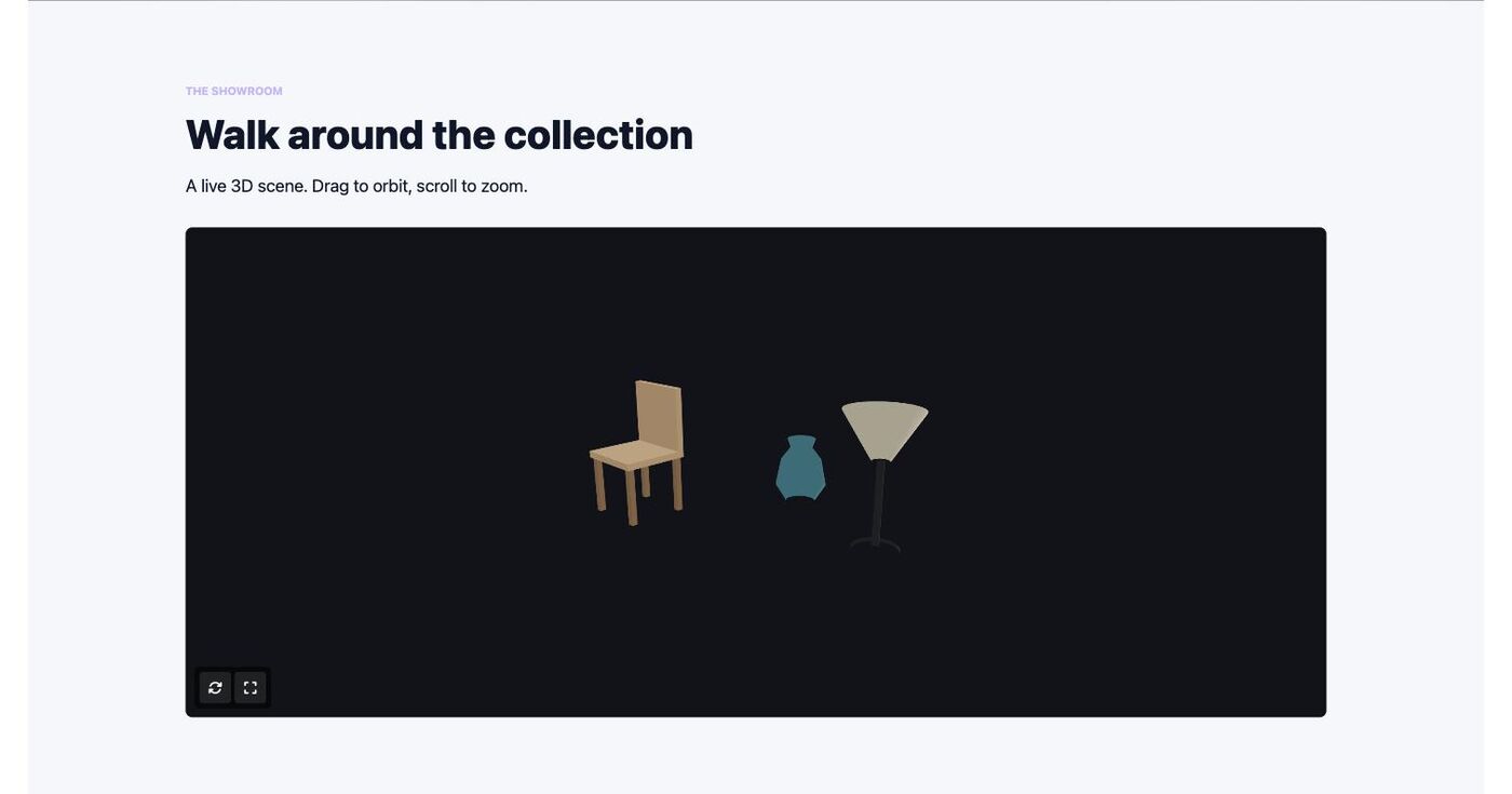
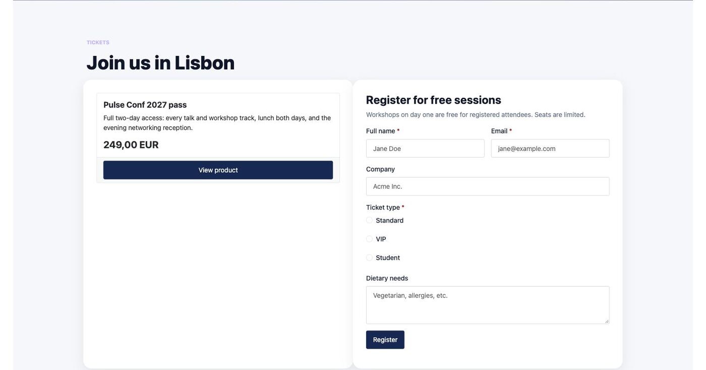
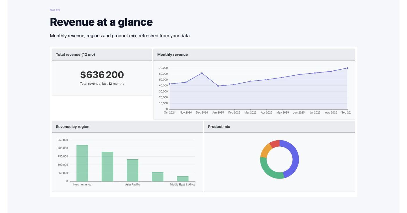
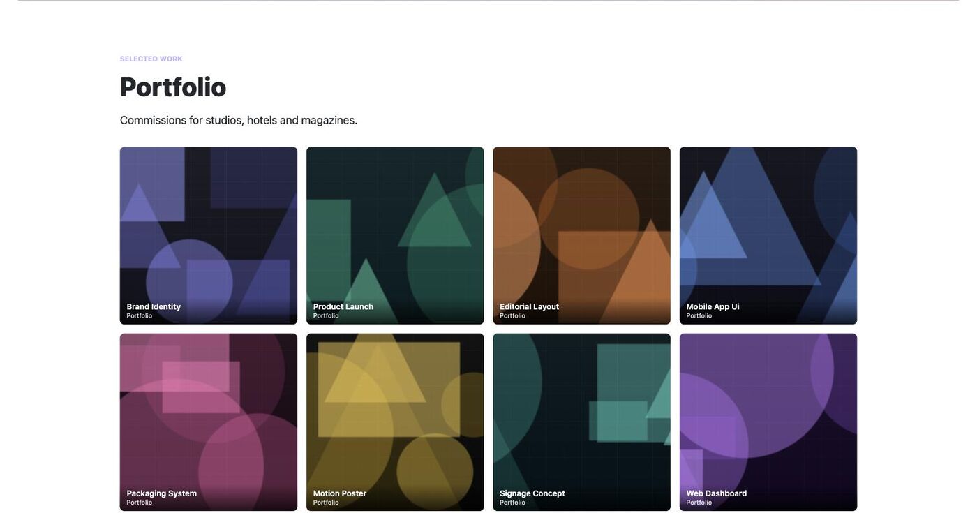
A page is skipped when an extension it needs isn't installed. See extras/demo/suite/README.md.
Layouts as modals and sidebars
A layout's Display mode (layout screen, Details tab) is one of:
- Page (the default): shown where it is placed — a menu item, a module, an article;
- Modal: a dialog over the page (below);
- Sidebar: a full-height panel sliding in from the Start (left) or End (right) edge —
a menu, a cart, filters, a contact form. It takes the Width you give (default
24rem, never wider than the screen), an optional Backdrop that dims the page, a close button, Esc and a click outside to close; focus stays inside the panel while it is open (even without backdrop) and goes back to the link afterwards. It opens exactly like a modal: a link to#oui-layout-12,data-oui-layout="12", a scenario's Open a layout (modal or sidebar) action, oropenLayout().
Any layout can open in a dialog instead of sitting in a page: a newsletter sign-up, a members offer, a video. Open the layout (Components → Blocks → Layouts, click its title) and, in the Details tab, set Display mode to Modal, then choose:
- Size (small, medium, large, extra large, full screen) or a Width such as
32rem; - Position: centre, top, a bottom corner or a side panel (start/end follow the page direction);
- Backdrop (dims the page and keeps it inert), Close button, Close on a click outside;
- Accessible name, announced by screen readers (default: the layout title).
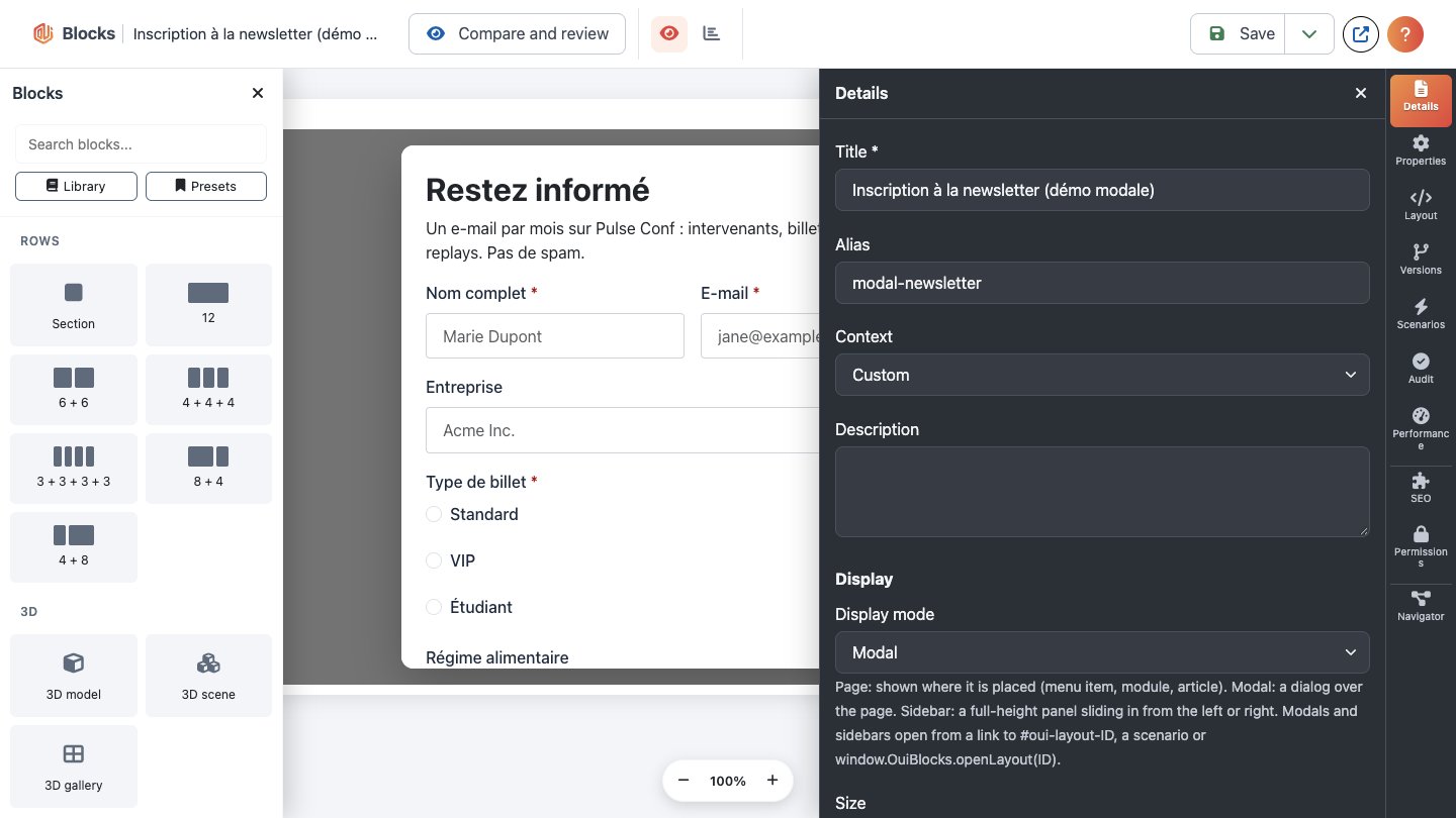
The Layouts list marks these layouts with a Modal or Sidebar badge, and the builder's Preview shows them in their dialog frame.
Opening one. Link a button (or any text) to #oui-layout-12, where 12 is the layout's ID; any
element with data-oui-layout="12" works too. Pages that contain such a link load the small modal
script by themselves. Esc, the close button or a click outside closes it, and focus goes back to
the link. On phones the dialog takes the screen width. Scenarios can open layouts too.
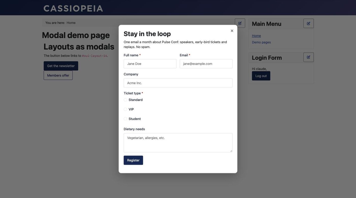
The content is fetched when the visitor first opens it, with the visitor's access: a layout (or a part of one) they may not see never reaches the browser. A form inside works as it does on a page.
For developers, on any page that loads the com_blocks.modal web asset:
const dialog = await window.OuiBlocks.openLayout(12, { size: 'lg', position: 'side-end' });
await window.OuiBlocks.openLayout(12, { display: 'sidebar', side: 'start' }); // as a sidebar, whatever its mode
window.OuiBlocks.closeLayout(12);   // or closeLayout() for whichever is open
document.addEventListener('ouiblocks:modal-close', (e) => console.log(e.detail.id, e.detail.reason));
Restyle it with the --oui-modal-* custom properties (--oui-modal-bg, --oui-modal-radius,
--oui-modal-backdrop…) on .oui-modal.
Scenarios
A scenario reacts to what a visitor does with actions on the page. Components → Blocks → Scenarios, then New:
- When (any of): one or more triggers. The first that happens starts the scenario: page load, time on page, scroll depth, exit intent (the pointer leaves towards the tabs; on phones, an optional fast scroll up), number of visits, pages seen this visit, inactivity, a click on an element, an element scrolled into view, a custom event.
- Only if (all of): optional conditions, all required: device (by screen width), logged in or
guest, user groups, language, page address, query parameter (
utm_source…), referrer, days and hours, new or returning visitor, a stored value (cookie or browser storage). Logged in, groups and language are checked on the server: the browser never learns about a scenario it can't run. - Then do: actions in order: open a layout in a modal (see above; its size and position can
be overridden), close it, show or hide an element, add or remove a CSS class on the page, store a
value, dispatch an event (which can start another scenario), go to a page of this site, push a
dataLayerevent for Google Tag Manager.
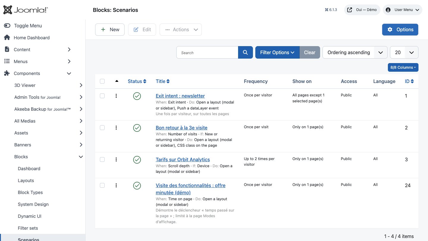
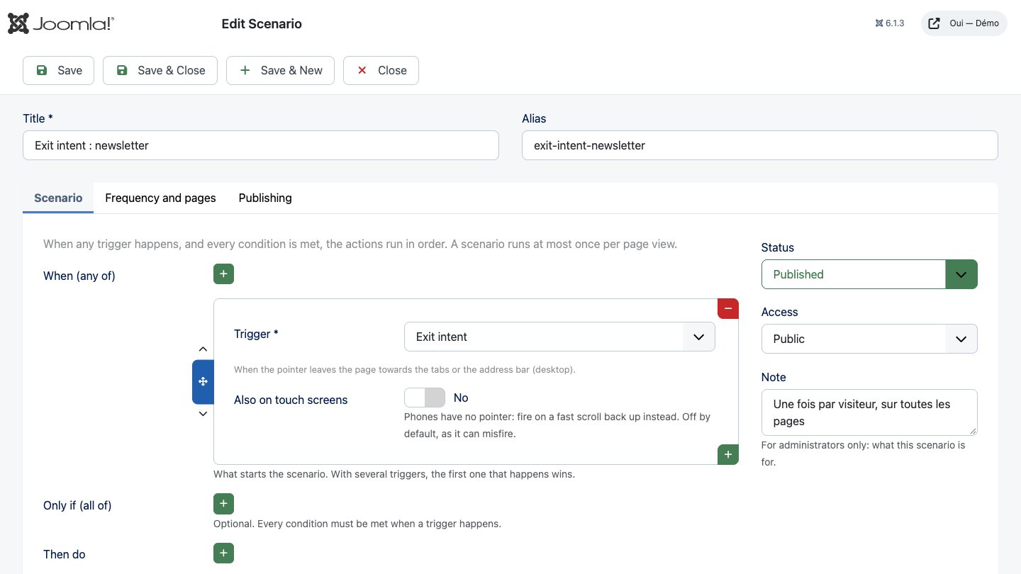
Each step shows its own settings once you pick its type. In Frequency and pages choose how often a visitor sees it (every page view, once per visit, once per visitor, up to N times, or again after N days) and on which pages it runs (the same menu-item rule as Dynamic UI). The right-hand column holds the status, access level and language; Publishing has start and end dates.
A scenario runs at most once per page view, and only one modal is shown at a time: the next waits until the visitor closes the first. With several scenarios on a page, their order in the list is their priority. Visits and frequencies are counted in the visitor's browser (a visit is a browser session; clearing browsing data starts over), and only on pages where a scenario runs.
Pages without a matching scenario load nothing. The System - Oui Blocks scenarios plugin must be enabled (it is, after installing the package).
Testing. While logged in to the site as an administrator (Blocks: manage), add
?oui_scenarios_debug=1 to a page address: the browser console shows a table of every decision
(armed, skipped by frequency or a condition, run, and scenarios skipped on the server with the
reason). In the console, OuiBlocks.scenarios.reset() forgets the visits and runs kept in that
browser.
Examples: exit intent → open the newsletter modal, once per visitor; 3rd visit, returning
visitor → open a "welcome back" modal and add the class is-returning, once per visit; scroll 60%
on the pricing page, desktop or tablet → open the pricing modal, up to 2 times.
Editing on the page
Logged in on the site, anyone who may edit a layout in the builder (Edit, or Edit Own on
layouts they created) sees an Edit page button in the bottom-right corner of every page showing
that layout: a menu item, a mod_blocks module, {blocks} in an article or a Blocks layout field.
Visitors and other users get nothing extra: no button, no script, no markers.
Turn it on and every element of the layout is outlined on hover and keyboard focus:
- Headings and button labels: click and type. A button's link is edited with Enter or Ctrl/Cmd+K (or the link button of the small toolbar).
- Text: click and type. The small toolbar has bold, italic, link and lists (Alt+F10 reaches it from the keyboard). Pasted text keeps simple formatting only, and the text goes through Joomla's text filters for your user groups when saved, as in the builder.
- Images: click (or Enter) to change the path or URL and the alternative text.
- Spacers and dividers are left alone. Any other element offers Edit in the builder, which opens the layout's builder (on the site) in a new tab.
- A locked part (see Who sees what) is outlined in grey and can't be changed; neither can a field that shows article data (dynamic data).
When the same layout appears twice on the page, both copies change as you type. Save (or Ctrl/Cmd+S) stores the changes as a new version with a history entry ("Quick edit"), exactly like a builder save; Discard puts everything back. Leaving the page or turning editing off with unsaved changes asks first. If someone saved the layout after the page was loaded, the save is refused: copy your text, reload and edit again.
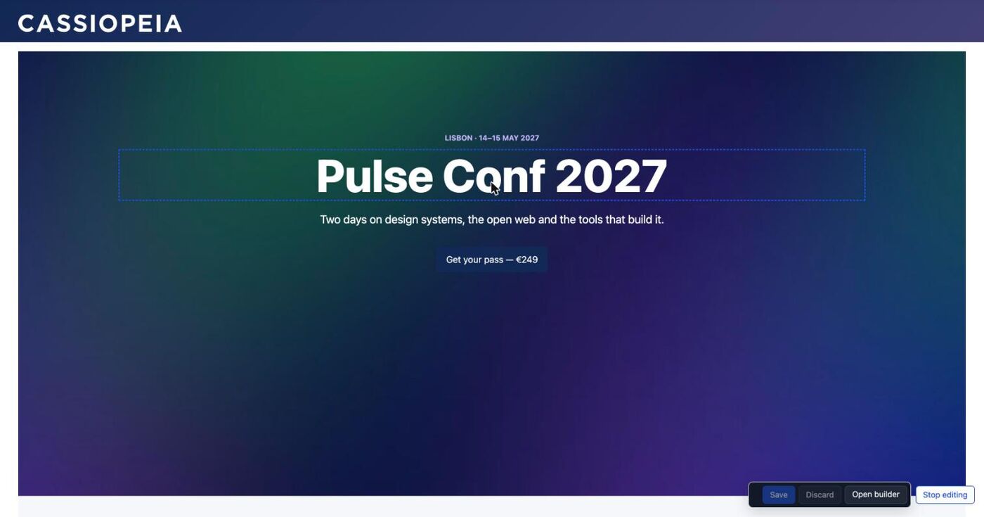
Texts show their saved content while you edit; content plugins (e.g. {loadmodule}) run again
after a reload.
Opening the builder
In edit mode the bar also has Open builder: the same builder as in the administrator (library, navigator, the same action bar and side panels except Scenarios, which are managed in the administrator), full window on the site, with only Save, Close and Documentation above it (the layout's settings stay in the administrator's tabs), for the layout on the page (a short list when the page shows several). You need no administrator access: the builder works with your site login and the same rights: Edit / Edit Own on the layout, Design to change design classes, Create to save presets, and edit locks apply. Close brings you back to the page, reloaded with your changes. Images and videos are given as a path or URL, as in the administrator's builder.
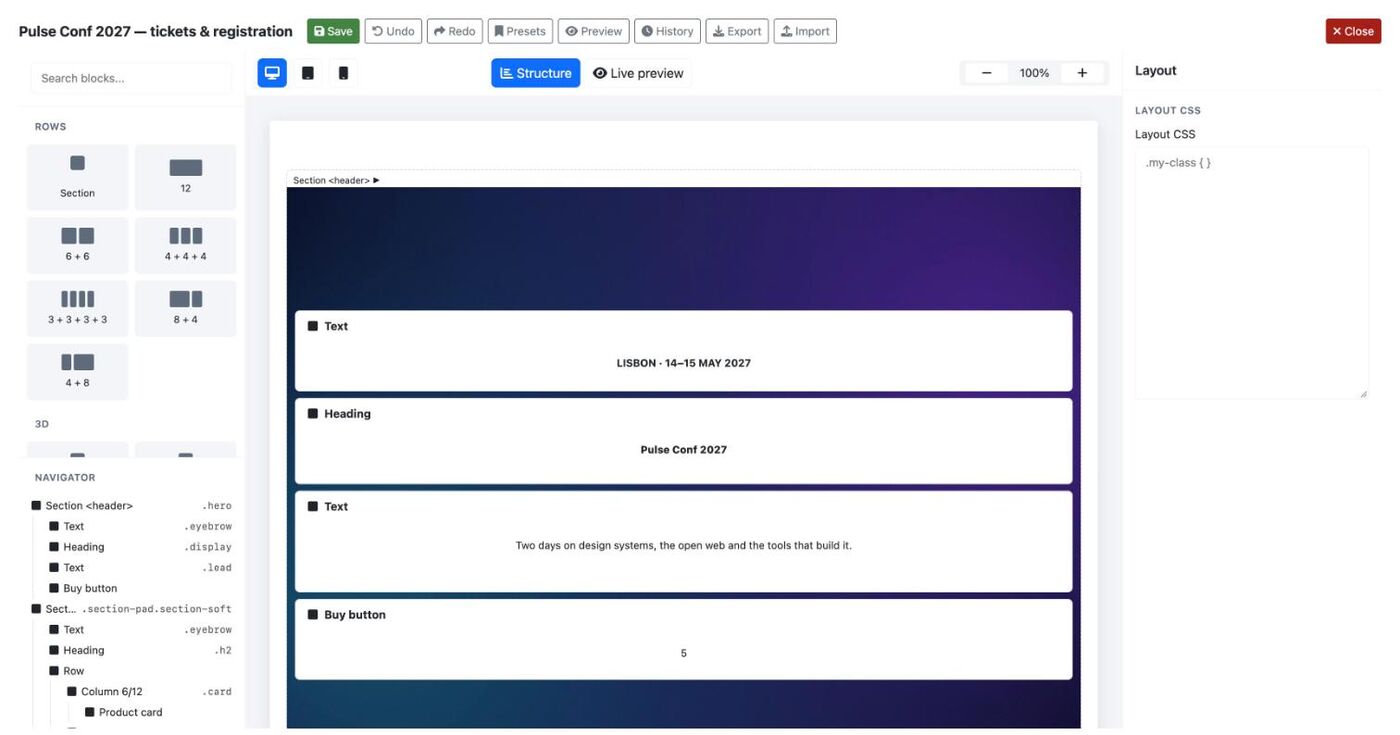
The builder is made for a desktop screen; on a phone it says so, and Edit page still works.
Publishing, review and translations
With Drafts on (Options → Publishing; on for new installations, off on sites upgraded from an earlier version), a layout has two versions: the published one, which visitors see, and a draft, which editors work on. Saving in the builder, on the page (quick edit), in the translation view or restoring a revision writes the draft; nothing changes on the site until the draft is published. Existing layouts need nothing: after the update they are "published, no draft".
Options → Publishing:
| Option | What it does |
|---|---|
| Drafts | Yes: saves go to the draft. No: every save is published at once. New installations start with Yes. |
| Require approval | Only an approved draft can be published or scheduled. |
| Preview links valid for | Life of a shared preview link, 1 to 720 hours (default 72). |
| Missing translation | What a multilingual site shows when a layout has no version in the page's language: nothing (default), the default language version, or the layout as it is. |
The publish bar
The builder shows a bar above the canvas with the draft's status (Published, no draft, Draft, In review, Approved, Rejected, and the scheduled date) and what you may do:
- Publish: the draft becomes the published version (unsaved edits are saved first). Every publication is kept as a numbered, unchangeable release; the first one also keeps what was published before.
- Submit for review: for editors who may not publish, or when approval is required.
- Schedule…: pick a date and time; the scheduled task Oui Blocks – Publish scheduled drafts (System → Scheduled Tasks, created on install, every 5 minutes) publishes it then. Saving the draft again cancels the schedule.
- Preview link: a read-only link to the draft that works without an account, until it expires or the draft changes. Send it to a client or a reviewer.
- Compare and review: opens the review page.
- Discard draft: click twice; the published version stays.
On the page, quick edit's Save writes the draft ("Saved to the draft"); users who may publish also get Save and publish.
Review
Compare and review (also in the layout's toolbar and from the draft badge in the Layouts list) shows:
- the changes node by node (added, removed, changed, moved) and whether the CSS changed;
- the published version and the draft side by side;
- the actions: submit, approve, reject (with a reason), publish with a release note, schedule, cancel a schedule, preview link, discard;
- the review history (comments and every step, per draft version) and the list of releases.
Who does what: editors (Edit, or Edit Own on their layouts) save drafts, submit, comment and discard; users with Edit State approve, reject, publish and schedule. Reviewers receive a Joomla private message (emailed according to their messaging options) when a draft is submitted; the author when it is approved or rejected. The Layouts list has a Publishing filter and tells reviewers how many drafts wait for them.
The gate: a rejected draft is never published; with Require approval, only a draft approved at its current version is. Any save after an approval puts the draft back to "draft". A scheduled publication checks the same rules when it runs, as the user who scheduled it.
Oui Blocks keeps these stages itself rather than using Joomla's Workflows: in Joomla a workflow moves an item's own published state, whereas here the layout stays published while a new version of it is reviewed.
Translations
On a multilingual site (Language Filter plugin with associations on), layouts can be associated like articles. The Layouts list shows each layout's languages (click one to open its translation) and the missing ones.
- Duplicate & associate (in the translation view, a link per missing language): copies the layout — tree, design classes, CSS, display settings — into that language, unpublished, and associates it.
- Translations (layout toolbar): the texts of the layout next to the same element's texts in the source language. Texts still identical to the source are marked Not translated; fields bound to article data are not listed. Saving writes the draft (publish it, then publish the layout itself).
- Menu items, modules,
{blocks}and reusable layouts pick the associated layout of the page's language by themselves; without one, the Missing translation option decides.
Template overrides
Components → Blocks → Overrides lists the override files of every site template (child
templates included) under templates/<template>/html/: component views, modules, layouts and
plugins. Each file is marked Alternative layout (used only where you choose it) or Replaces
the original (a file with the original's name, used everywhere), and files made here show
Oui Blocks: Blocks layout or Oui Blocks: copy (read from their header comment).
New override is one page in two columns. On the left: 1. Site template, then 2. What to
override, a searchable list grouped as Articles (com_content) first — Single article,
Category blog, Category list, Featured articles, Archived articles, List of all categories,
Article form, each followed by its parts (blog_item.php…) — then other components, modules,
layouts and plugins. On the right: 3. The new file, 4. Use, and a Summary that follows
your choices: the file that will be created (templates/<template>/html/…), where to choose it
afterwards, and warnings (the file already exists, replacing the original). The new file:
- Shows an Oui Blocks layout (recommended): a small PHP file that renders the chosen layout. On an article page the article is the source of the layout's dynamic data (section 8); on other views and in modules the layout shows its own content for now. When the layout is unpublished, outside its dates, not in the visitor's access levels or language, or Oui Blocks is not installed, the original output is shown, and visitors who may not read the article get the normal page.
- Copy of the original: the core file, to edit, as Templates → Create Overrides does. An
alternative copy keeps its sub-layouts (a category blog's
blog_item.phpbecomes<name>_item.php).
By default the file is an alternative layout (blocks-<layout alias>.php, or the name you
give). The message after creating it says where to choose it: an article's Options → Layout, a
category's Options → Layout, a menu item's Layout option, or a module's Advanced → Layout.
Replace the original writes a file with the original's name instead (e.g. default.php), which
changes every page using it with that template; it is never done unless you pick it, and it is the
only choice for layouts and plugin files.
Clicking a file opens it in Joomla's code editor. Save checks the PHP syntax first (without running it) and refuses a file with a parse error, showing the line; what you typed stays in the editor. Each save, restore and delete keeps the previous version as a backup (in the Oui Blocks revisions table, not in the web folder), restorable from the editor; deleted overrides are listed under Deleted overrides with Restore. When the file has an original, the editor shows the differences with it.
Only .php files inside a site template's html folder can be written (no .., no symbolic
links). Overrides are code run on every page, so creating, editing, restoring and deleting them
needs Configure/Admin (core.admin) on Oui Blocks and Edit (core.edit) on Templates.
Other users who can open Oui Blocks see the list read-only, without the file contents. Every write
checks the form token and is recorded in the User Actions Log.
This supersedes extras/article-layout: instead of copying its file by hand, create a Blocks
layout override of com_content/article/default.php. That extra still works for choosing the
layout per article with a "Blocks layout" field.
Audit and structured data
The Audit panel
The Audit panel of the builder (rail on the right) checks the layout you are editing, saved or not, and lists what to fix. It runs on your site only: nothing is sent to any service, and it never changes the page. Choose an issue to select its part of the layout in the canvas and the navigator; Run audit checks again after your changes. Each issue is an Error (a real barrier: fix it), a Warning (very likely a problem) or a Notice (worth a look).
What it checks, on the page as visitors get it:
| Area | Checks |
|---|---|
| Headings | one H1 per page (the menu item's page heading counts), no skipped level, no empty heading |
| Images | missing or empty alternative text (tick Decorative image on an Image element whose picture says nothing), a file name as alt, the same alt on different pictures, missing width and height |
| Links and buttons | no name, vague texts (“click here”, “read more”, “cliquez ici”…), javascript: links |
| Structure | duplicate ids, more than one main (and a section using main inside the template's own), several top-level headers or footers |
| Forms | fields without a label (forms from other extensions included) |
| Language | invalid lang attributes |
| Media | videos without captions (the Video element takes a WebVTT Captions file) or poster, embedded frames without a title, media playing sound on its own, videos starting without controls |
| Motion | marquee / blink, layout CSS that animates without a prefers-reduced-motion rule (Oui Blocks' own effects and widgets already stop) |
| Contrast | text on background from the System Design (classes and element styles), under 4.5:1 |
| Target size | links and buttons under 24 × 24 px (sizes set on them or on their element) |
| SEO | for each menu item showing the layout: meta description (present, 50–160 characters), browser title length, several menu items for the same page, whether Joomla adds a canonical link (System - SEF → Site Domain) |
| Structured data | valid JSON-LD with the schema.org context and the properties search engines require for each type |
The administrator builder does not see template overrides of element layouts or site modules shown by a Module position element; the builder on the site does.
Blocking publication
Options → Audit → Block publishing on audit errors (off by default): a layout with audit errors cannot be published (layout form or list), and saving a published layout (builder, editing on the page, restoring a revision) is refused when it adds errors; errors it already had do not lock it. Warnings and notices never block. Give the permission Publish despite audit errors to the groups that may publish anyway (Super Users have it).
Structured data elements
The Structured data category of the library (plugin Blocks Schema - Structured data) adds schema.org JSON-LD to the page, inside the element's own output (never in the page head):
| Element | Shows | Structured data |
|---|---|---|
| FAQ | questions as an accordion (native, keyboard friendly) | FAQPage |
| Organization / local business | optional contact card | Organization, LocalBusiness, Restaurant, Café, Store… (address, hours, social profiles) |
| Product data | nothing (show the product with other elements) | Product, typed in or read from an Oui Pay product (its price is then always current) |
| Event data | nothing | Event (dates, place or online link, status, tickets) |
| Breadcrumbs | Joomla's breadcrumb trail (optional) | BreadcrumbList |
| Article data | nothing | Article, News article or Blog post of the article the layout is shown with |
| How-to | numbered steps with pictures | HowTo |
Dates are written like 2027-03-12 09:30; durations like PT30M. The audit tells you when a required
property is missing. Each element renders through a layout your template can override
(templates/<template>/html/layouts/blocks/schema/<name>.php). Joomla 5's own schema.org plugins add
their data to the page head; use one or the other for the same type.
Performance
Oui Blocks keeps pages light without you doing anything; the options are in Components → Blocks → Options → Output and Media.
CSS per page. A page gets only the rules of the design classes it uses (read from what the
layout rendered, rich text included), its own node styles and its custom CSS — never the whole
System Design. The tokens (--oui-*) and colour modes always come along. The CSS goes to a static
file, media/com_blocks/cache/css/<hash>.css, written once and linked like any stylesheet: the
browser caches it, the name changes when the CSS does, and there is no inline style for a Content
Security Policy to allow. Files nobody asked for in 30 days are removed. Choose CSS delivery:
Inline if the site cannot write to the media folder (Blocks falls back to inline by itself when a
file cannot be written).
Using design classes (bx-…) in HTML that Blocks does not render — a template override, another
extension? Turn off Only used design classes to send them all again.
Critical CSS (on by default). On the first layout of a page, the rules of its first section
(Critical sections, 1–5) are inlined in the head so the top of the page shows at once; the rest
is a normal stylesheet link placed right after those sections, which the browser holds back only for
what follows it, and preloaded from the head. No onload trick, no inline script: it works with a
strict CSP. The inline part carries Joomla's nonce when System - HTTP Headers adds one; with a
strict CSP without nonce, turn Critical CSS off (everything then comes from the static file).
Responsive images. Images picked from images/ are served in several widths (480, 768, 1200,
1600, 2400 px, never wider than the original or Maximum image width) and in WebP, plus AVIF when
PHP's GD library can write it (AVIF option). They are made on the site with Joomla's image
library the first time a page shows the image, a little at a time (a page never waits more than
about 1.5 s for them, and what is not ready yet is simply not offered), and stored in
media/com_blocks/cache/img. The original stays the fallback; a changed image gets new versions.
The Image element prints a <picture> with srcset/sizes (from its column's width), always
width/height (from Joomla's media data, the element's size or the file), decoding="async",
and loads lazily — except in the page's first section, never lazy, whose first image is fetched
first (fetchpriority="high"). Section background images use a WebP/AVIF version too, a smaller
one on phones, and a background video's poster is the WebP version.
Two new Image settings: Decorative image (empty alternative text, for images that say nothing; ignored when the image is a link) and Focal point (the part kept in view when the image is cropped, e.g. with both a width and a height).
Videos from YouTube or Vimeo show a play button (and your poster image) and load nothing from the video site until the visitor presses it; the player then starts in its place.
Performance panel. The builder's Performance panel (rail on the right) measures the unsaved draft as the site would deliver it to you: Blocks CSS (gzip, and its critical part), scripts the elements load, DOM elements, the weight of each image as served (and whether it has width/height and renditions yet) and remote assets, each against a budget (warning / limit).
| Measure | Budget (warning / limit) |
|---|---|
| Blocks CSS (gzip) | 20 KB / 50 KB |
| Scripts loaded by elements (gzip) | 100 KB / 300 KB |
| DOM elements | 800 / 1,400 |
| One image as served | 300 KB / 1 MB |
| All images as served | 1.5 MB / 4 MB |
| Remote assets | 0 |
The reference demo pages ship no unused class rules, no remote assets and about 2.5–2.9 KB of Blocks CSS (gzip).
REST API and webhooks
Oui Blocks has a REST API (Joomla Web Services) and webhooks, so other systems can read and edit layouts and be told when something changes. Both follow Joomla's permissions: the API never does more than the same user could do in the administrator.
Turning it on
- The package installs and enables Web Services - Oui Blocks (
plg_webservices_blocks). - The API user needs API Login (System → Global Configuration → Permissions,
core.login.api), a Joomla API Token (Users → edit the user → Joomla API Token; the User - Joomla API Token plugin decides which groups may have one) and Access Administration Interface on Oui Blocks (core.manage). - Send the token with every request:
X-Joomla-Token: <token>(orAuthorization: Bearer <token>).
curl -H "X-Joomla-Token: $TOKEN" https://example.com/api/index.php/v1/blocks/layouts
Endpoints
All under /api/index.php/v1/blocks/. Answers are JSON:API documents (data, meta, links,
errors as errors[{status, title}]).
| Method and path | What | Permission |
|---|---|---|
GET layouts |
Layouts (filter[search], filter[state], filter[language], page[offset], page[limit] ≤ 100) |
core.manage; users with only edit-own see their own |
POST layouts |
Create (title, alias, description, context, state, access, language, publish dates, display params, optional structure and css) |
core.create (+ core.edit.state to publish) |
GET layouts/{id} |
Metadata, with its ETag | core.manage |
PATCH layouts/{id} |
Change metadata (If-Match) | edit on the layout (+ core.edit.state for the state) |
DELETE layouts/{id} |
Delete (If-Match) | core.delete |
GET / PUT layouts/{id}/structure |
The tree and custom CSS (PUT: If-Match) | read: core.manage; write: edit on the layout |
POST layouts/{id}/presets |
Add a preset's content ({"preset": 3, "position": "end"}, If-Match) |
edit on the layout |
GET layouts/{id}/render |
The published layout as the site renders it for this user: html, css, styles, scripts. ?levels=1,2 narrows to some of the user's own viewing levels |
viewing levels only |
GET layouts/{id}/export, POST layouts/import |
The builder's export format; import creates a new layout | core.manage / core.create |
GET layouts/{id}/revisions, GET revisions/{id}, POST revisions/{id}/restore |
History and restore (If-Match = the layout's version) | edit on the layout |
GET / PUT design |
Design tokens and classes (If-Match) | blocks.design |
GET presets, GET presets/{id} |
Published presets | core.manage |
GET / POST scenarios, GET / PATCH / DELETE scenarios/{id} |
Scenarios, steps as [{type, settings}] |
as in the Scenarios screen |
Every write goes through the same checks as the builder: record permissions, check-out, edit locks (a locked node the user may not edit stays as it is, or the save is refused with its path), size limits (2,000 nodes, 12 levels, 2 MB of structure, 256 KB of CSS — refused, never cut), rich-text and URL filters, a revision and cache cleaning. Scenario steps are checked by the scenario form and their plugins.
Versions: ETag and If-Match
Every layout (and the design) has a version, returned as the ETag header. Send it back in
If-Match when you change it. If someone saved in between you get 412 Precondition Failed:
read it again and redo your change. Without If-Match the write is refused with 428.
curl -si -H "X-Joomla-Token: $TOKEN" .../layouts/12/structure | grep -i etag      # ETag: "7"
curl -X PUT -H "X-Joomla-Token: $TOKEN" -H 'If-Match: "7"' -H 'Content-Type: application/json' \
  -d '{"structure":{"schema":2,"root":[{"type":"oui/heading","settings":{"text":"Hello"}}]}}' \
  .../layouts/12/structure
Other statuses: 400 bad request (unknown attribute, not JSON), 403 not allowed, 404 not found or not visible to you, 409 checked out or locked, 413 too large, 422 invalid (too many nodes, form errors).
Webhooks
Components → Blocks → Webhooks (Super Users / core.admin): add an endpoint with its URL and
the events it wants: layout saved (a draft save too, with "draft": true in its data), layout published (a draft released too), layout deleted, revision restored, design
system saved, scenario saved. Each endpoint gets a signing secret (shown in its form, stored
encrypted; New secret on save replaces it).
Deliveries are queued and sent by a scheduled task: create one in System → Scheduled Tasks → New → Oui Blocks - Deliver webhooks, every minute (the Webhooks screen warns while there is none). A failed delivery is retried after 1, 2, 4… minutes (at most 6 hours) and marked dead after 8 attempts; the Delivery log shows each delivery's status, HTTP code and error, with Retry for dead ones. The log keeps a month.
What an endpoint receives — never content, only what changed and where to read it with your own API token:
{"id":"0f61310e-…","event":"layout.saved","created":"2026-09-29T06:11:34+00:00",
 "data":{"type":"layouts","id":12,"version":8},
 "links":{"self":"https://example.com/api/index.php/v1/blocks/layouts/12"}}
Headers: X-Oui-Blocks-Event, X-Oui-Blocks-Delivery (the same id on every retry: deduplicate on
it), X-Oui-Blocks-Timestamp and X-Oui-Blocks-Signature: sha256=<hex> where the hex is the
HMAC-SHA256 of timestamp + "." + raw body with the endpoint's secret. Check it in constant time
and refuse a timestamp more than 5 minutes away:
$body = file_get_contents('php://input');
$ts   = $_SERVER['HTTP_X_OUI_BLOCKS_TIMESTAMP'] ?? '';
$ok   = ctype_digit($ts) && abs(time() - (int) $ts) <= 300
     && hash_equals('sha256=' . hash_hmac('sha256', $ts . '.' . $body, $secret), $_SERVER['HTTP_X_OUI_BLOCKS_SIGNATURE'] ?? '');
tests/live/webhook-receiver.php is a complete receiver to start from.
Safety. Endpoints must use https and resolve only to public addresses: loopback, private, link-local (cloud metadata included), carrier-grade NAT and reserved ranges are refused, when the endpoint is saved and again at every delivery. The connection goes to the address that was checked, redirects are not followed, and requests time out after 10 seconds. For a receiver on your own network, add its host name, IP or range to Options → Webhooks → Allowed internal hosts (it may then also use http).
Migrating from other builders
Components → Blocks → Migrations imports pages built with SP Page Builder or YOOtheme Pro as new, unpublished layouts. The other builder is only read: nothing is changed or deleted there, so you can compare both versions side by side.
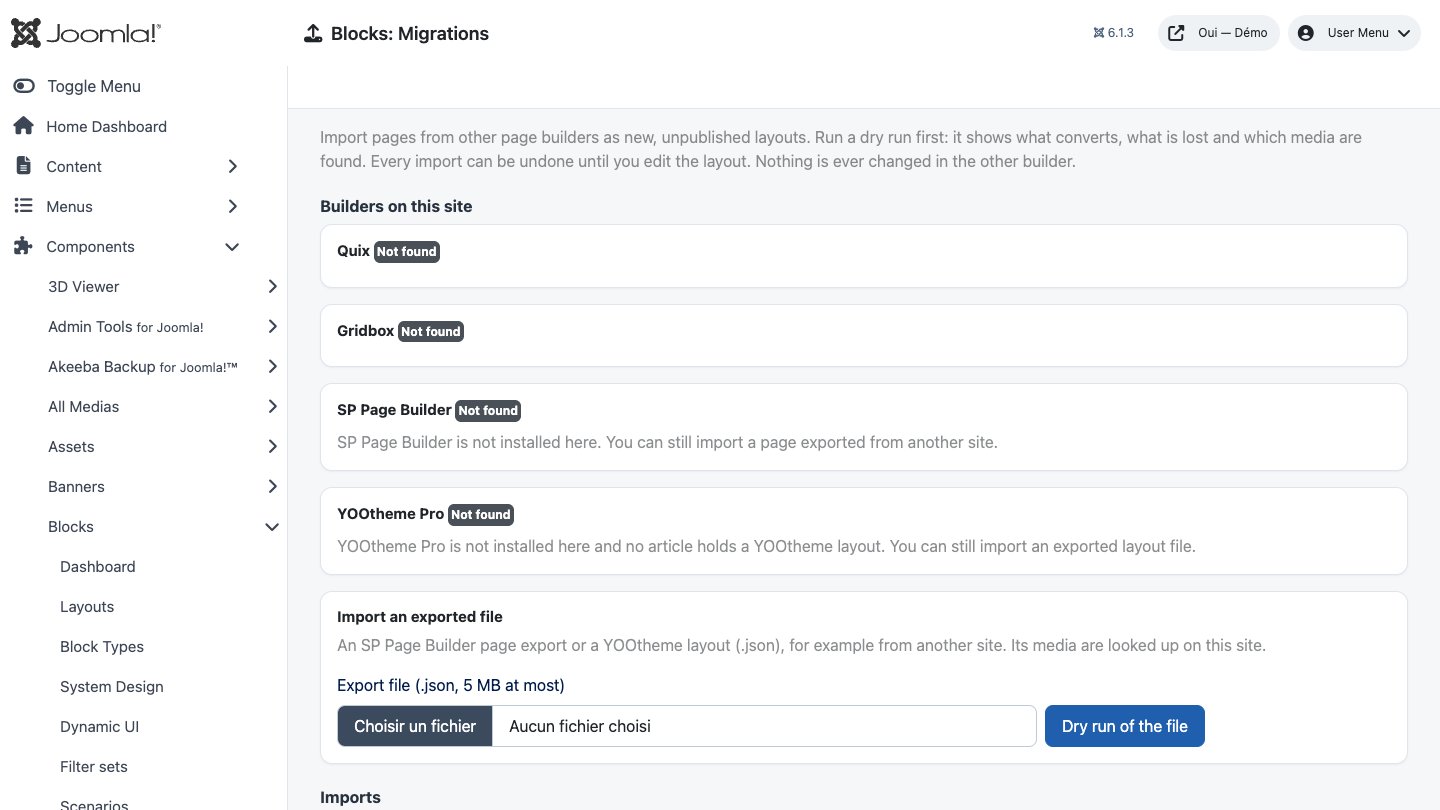
- Builders on this site lists every builder a migration plugin knows: installed or not, how many pages it holds. SP Page Builder pages come from its tables; YOOtheme pages are the articles built with its page builder and the builder templates of its template styles. Quix and Gridbox pages are detected and counted but cannot be converted yet (their storage formats are not documented; a converter will follow once validated on real exports).
- Tick pages and run a Dry run. Nothing is written; for each page you get:
- Coverage: the share of source elements (rows, columns and add-ons / elements) converted, fully or with a reported loss. Everything else becomes a placeholder.
- What is lost, per element type: a drop cap, a lightbox, a button icon, tabs shown as expandable panels…
- Media: found under
images/, to copy (files elsewhere on the site are copied toimages/oui-imported/<builder>/, never overwriting), missing (the path is kept: upload the file) or external (kept as a link). - Design: colours equal to one of your design tokens become that token
(
var(--oui-primary)…), fonts are listed (load them in your template), and the spacing, colours and backgrounds of sections, rows and columns become reusable classes (sppagebuilder-1a2b3c, shared by identical styles; you need the System Design permission, otherwise they stay on the elements). - Import selected: one page after the other, with a progress bar and a link to open each new layout in the builder. Each page is imported in one database transaction: if anything fails, nothing is created (no layout, no class, no copied file).
- Imports lists what was imported. Undo import deletes the layout, its revisions, the classes the import created (unless another layout uses them) and the files it copied. Undo is refused once you have edited the layout, so none of your work is lost: delete it yourself if you no longer want it.
Import an exported file takes an SP Page Builder page export or a YOOtheme layout file
(.json, 5 MB at most), for example from another site; its media are looked up on this site.
Placeholders
Content with no Oui Blocks equivalent (a countdown, a pricing table of another builder, raw HTML with scripts or iframes, a module chosen by id, a YOOtheme element fed by several articles…) is kept as a Not converted element: visitors see nothing; in the builder it shows what it was and why, and its settings hold the original data, to rebuild it by hand. Delete it when done.
What converts
| SP Page Builder | Oui Blocks |
|---|---|
| Row (title, subtitle, padding, margin, colours, background image/video/overlay, full width, id, class, hidden on devices, animation) | Section (+ heading and text) holding a grid; styles as a class; fixed background → parallax; fadeIn… → reveal |
Column (width from its class, the row layout 4+8 or 4.x/5.x widths; padding, colours, background image) |
Column (a background image becomes an inner section) |
| Heading, text block, image, button, button group, video, divider, empty space, alert | The matching core elements (typography and alignment as styles) |
| Feature box, pricing, person | Image + heading + text (+ button / profile links) |
| Icon | Text with the Font Awesome class (shown if the template loads Font Awesome) |
| Accordion, tabs | Native expandable panels (<details>), keyboard accessible |
| Gallery / carousel / image carousel / testimonial / testimonial pro / animated number / map | Oui Widgets framed gallery, image box slider, testimonial slider, animated counter, map |
| Contact form, form builder | OUI Forms element (pick or create the form) when OUI Forms is installed, otherwise placeholder |
| Module (position), progress bar, raw HTML (plain) | Module position, <progress>, text |
| YOOtheme Pro | Oui Blocks |
|---|---|
Section (style, width, padding, height, image, overlay, mp4 video, text colour, HTML element, animation), row, column (widths 1-3…, image) |
Section, grid, columns |
| Headline, text, image, button items, list, description list, quotation, alert, table, divider, video, HTML (plain) | Core elements |
| Grid (items), panel, overlay | A grid with one column per item (image, title, meta, content, link) |
| Gallery, slideshow, slider, map | Oui Widgets elements |
| Accordion, switcher | Expandable panels |
| Module position | Module position |
| Dynamic content of the page's article (title, content, intro text, author, category, date, link, images, custom fields by name) | Dynamic data bindings |
The builder's Import button (section 11) uses the same converters for one file, added to the open layout: styles stay on the elements and no file is copied.
Troubleshooting
- The live preview stays empty
- Your site forbids being shown in a frame: allow X-Frame-Options SAMEORIGIN and Content-Security-Policy frame-ancestors 'self'.
- An element from another Oui extension is missing
- Enable its "Blocks - …" plugin in System → Plugins (it is enabled on the package's first install).
- A scenario doesn't fire
- Logged in as an administrator, add ?oui_scenarios_debug=1 to the address: the console explains each decision. OuiBlocks.scenarios.reset() clears the counted visits.
- A save is refused
- A locked element was changed, or the layout changed since you opened it: reload, then redo the change.
Updating and uninstalling
Before an update, back up files and database and read the changelog. Updates keep your layouts, classes, scenarios and settings; an update never re-enables a plugin you disabled. Uninstalling the package removes the component, its plugins and the module.